บทเรียน figma · intermediate · 60 นาที
สร้าง Thai Design System ใน Figma
ตรวจสอบข้อมูลเมื่อ April 2026
สิ่งที่คุณจะได้
Figma design system สำหรับผลิตภัณฑ์ไทยระดับ production: tokens สีจากไทยโทน, styles typography สองภาษา, ชุด components หลัก (Buttons, Inputs, Navigation, Cards, Modals) ที่ขนาดรองรับความยาวของเนื้อหาไทย และลวดลายประดับที่อ้างอิงวัฒนธรรมภาพไทยโดยไม่ตกไปเป็นแบบ brochure ท่องเที่ยว ระบบออกแบบเพื่อส่งงานให้ทีมอื่น — developers ได้ token ชื่อเดียวสำหรับทุกค่าสีและ spacing และ library เผยแพร่สะอาดไปยังไฟล์ผลิตภัณฑ์ที่สมัครใช้
สิ่งที่ต้องเตรียม
- ซอฟต์แวร์: Figma Desktop 2026 แผน Organization หรือ Team สำหรับ shared libraries
- ฐาน typography: ทำ ตั้งค่าไทโปกราฟีไทยใน Figma เสร็จแล้ว บทความนี้ต่อยอดจากการตั้งค่านั้น
- อ้างอิงสี: พาเลตต์ไทยโทน — เราใช้ชุด 24 สีที่คัดแล้ว ไม่ใช่ครบ 168 สี
- ลวดลาย: เวกเตอร์ลายที่ simplify แล้วจาก /th/patterns/ — ลายเมฆ ลายดอกไม้ สำหรับบริบทที่ไม่ศักดิ์สิทธิ์
- เวลา: 60 นาทีสำหรับระบบหลัก; การขยาย components ทำต่อเนื่อง
- บริบททางวัฒนธรรม: Design system ไทยเดินระหว่างความเฉพาะทางวัฒนธรรมกับความใช้งานสากล ลายประดับมากเกินไปได้ aesthetic แบบท่องเที่ยว; น้อยเกินไปได้ generic แบบ Silicon Valley กฎ 10% (ด้านล่าง) เป็นแนวทางในการทำงาน
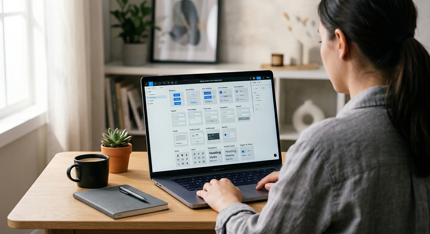
Step 1: สร้างโครงสร้าง variable 3 collection
File > New Design File ตั้งชื่อ ThaiGraph Design System เปิด Local Variables (พาเนลขวา) สร้าง 3 collections:
- Primitives — ค่าสีดิบ ค่า typography ค่า spacing ไม่มีความหมายเชิง semantic
- Semantic — tokens ตามบทบาท (primary, success, error, text-body, surface-raised) aliased จาก Primitives
- Component — override เฉพาะ component (button-primary-bg, input-border-focus)
โครงสร้าง 3 ชั้นนี้เป็น convention ของ Figma design system ปี 2024+ และตรงกับวิธีที่ engineering คาดหวัง tokens Developers สมัครใช้ Semantic และ Component; Primitives มีเพื่อถูกอ้างถึงโดย layer บน
Step 2: Seed Primitives ด้วยชุดไทยโทน
ใน Primitives เพิ่ม Variables ชนิด Color สร้างชุดหลักไทยโทน 24 สี: thaitone/red-500 (#C5242C), thaitone/gold-500 (#D4A029), thaitone/indigo-900 (#1B2845), thaitone/off-white-50 (#F4EFE6) พร้อม scale 100/200/…/900 สำหรับแต่ละสี 24 สีครอบคลุมแดง ทอง คราม ขาวนวล เขียว (เขียว) ม่วง น้ำเงิน (ฟ้า) และเทา — มีช่วงพอสำหรับ 95% ของ UI โดยไม่ต้องแบก 168 tokens เพิ่ม typography Primitives: font-family/thai-body = Sarabun, font-family/thai-display = Kanit, font-family/latin-body = Inter Spacing Primitives: 4, 8, 12, 16, 24, 32, 48, 64, 96 — grid 8-point ที่ fintech ไทยมาตรฐานแล้ว (Bank of Thailand guideline, 2023)
Step 3: สร้าง Semantic tokens
ใน Semantic collection สร้าง role tokens ที่ alias จาก Primitives เพิ่มสอง modes: Light และ Dark สำหรับแต่ละ mode alias semantic tokens:
text/primary— Light mode: thaitone/indigo-900 Dark mode: thaitone/off-white-50text/secondary— Light: gray-700 Dark: gray-300bg/canvas— Light: off-white-50 Dark: indigo-900bg/raised— Light: white Dark: indigo-800accent/primary— Light และ Dark: thaitone/red-500accent/gold— Light และ Dark: thaitone/gold-500border/default— Light: gray-200 Dark: indigo-700status/success— Light: green-600 Dark: green-400status/error— Light: red-700 Dark: red-400
ตอนนี้ทุก component อ้างถึง semantic tokens เท่านั้น การส่ง dark mode ในอนาคตไม่ต้องเปลี่ยนที่ระดับ component
Step 4: สร้าง Button component ด้วย default ที่รองรับความยาวไทย
Create > Component สำหรับ Button Auto Layout horizontal padding 12 px vertical 24 px horizontal, gap 8 px เพิ่ม Text layer ใช้ Body / Thai text style ตั้งข้อความ default เป็น ยืนยัน จำกัด min-width ของปุ่มที่ 104 px — ป้ายปุ่มไทยยาวกว่าอังกฤษเฉลี่ย 22% (KBTG UX Writing Guidelines, 2023) ดังนั้นปุ่มขนาดอังกฤษจะตัดข้อความไทย สร้าง Variants: Primary (accent/primary bg ข้อความขาว), Secondary (bg/raised ขอบ 1px border/default), Tertiary (โปร่งใส ข้อความ text/primary) สำหรับแต่ละตัว สร้าง Property State: Default, Hover, Pressed, Disabled เผยแพร่ Subscribers ได้ปุ่มที่ขนาดถูกต้องสำหรับเนื้อหาไทยโดยไม่ต้อง override ด้วยมือ
Step 5: สร้าง Input field component
Inputs ต้องการสองฟีเจอร์เฉพาะของไทย: padding แนวตั้งภายในที่ใหญ่ขึ้นเพราะเนื้อหาไทยใช้พื้นที่แนวตั้งมากกว่า (สระอยู่บน ตัวห้อยอยู่ล่าง) และไม่มี letter-spacing สร้าง Input component: Auto Layout vertical padding 14 px vertical 16 px horizontal (ไม่ใช่ 8 px — นั่นคือ default ลาติน) text style Body / Thai เพิ่ม variants สำหรับ State (Default, Focus, Error, Disabled) และ Size (Small, Medium, Large) label ด้านบน input ใช้ Label / Thai style helper text ด้านล่างใช้ Caption / Thai เผยแพร่ layout ฟอร์มเรนเดอร์ฟิลด์ไทยโดยไม่ตัดตัวห้อย
Step 6: สร้าง components ประดับ
นี่คือจุดที่ความเฉพาะทางวัฒนธรรมอยู่โดยไม่ตกไปเป็น pastiche สร้าง 3 components เล็ก:
- DividerKanok — เส้นคั่นลายกนกสูง 2 px กว้าง 120 px สี accent/gold ใช้น้อย: หนึ่งต่อหน้าจอ ที่ด้านบนของเนื้อหาพรีเมียม
- BadgeMekLai — ป้าย badge รูปเมฆสำหรับเนื้อหาโปรโมชั่น รูปร่างเมฆเป็น container outline ใช้สำหรับข้อเสนอ บริบทอุดมสมบูรณ์ (food apps, wellness)
- AccentDokMai — ลายดอกไม้ประดับเป็น glyph นำหน้า 16 × 16 px สำหรับหัวข้อเฉลิมฉลอง ใช้สำหรับข้อความเทศกาล การ์ดแต่งงาน
กฎ 10%: บนหน้าจอใด ๆ พื้นที่ภาพไม่ควรเกิน 10% ที่มีลายประดับไทย เกิน 10% ตกไปเป็น brochure ท่องเที่ยว ต่ำกว่า 3% อ่านว่า generic จุดที่ดีคือประดับหนึ่งจุดต่อ hero section หนึ่ง
Step 7: เผยแพร่ จัดทำเอกสาร สมัครใช้
Assets panel > Publish Library กรอก release notes ว่าเปลี่ยนอะไร ติ๊กทั้ง styles variables และ components เผยแพร่ สร้าง Documentation page ใน library file: cover page แสดงพาเลตต์ไทยโทน, typography specimen, component matrix, การเปรียบเทียบความยาวไทย-ลาติน, กฎ 10% และลิงก์กลับไปที่ /th/colors/thaitone/, /th/fonts/ และ /th/patterns/ สำหรับอ้างอิงที่ลึกกว่า Subscribers ในไฟล์ผลิตภัณฑ์เปิดใช้ library ผ่าน Assets > Libraries > ThaiGraph Design System ทีมผลิตภัณฑ์ทุกทีมแชร์แหล่งความจริงเดียวสำหรับการตัดสินใจออกแบบไทย
ข้อควรรู้ทางวัฒนธรรม
สองวิธี fail ของ Thai design system คือประดับมากเกินไปและประดับน้อยเกินไป ระบบที่ประดับเกินใส่กรอบลายกนกในทุก card ลายเมฆเป็นพื้นหลังของทุก modal และทองไทยโทนในทุกปุ่ม; ผลลัพธ์อ่านว่าเป็นโปรโมทท่องเที่ยวหรือ branding ร้านอาหาร ไม่ใช่ผลิตภัณฑ์สมัยใหม่ ระบบที่ประดับน้อยเกินถอดความเฉพาะทางวัฒนธรรมออกทั้งหมดและได้ aesthetic แบบ Silicon Valley ที่ localise ที่ผู้ใช้ไทยพบว่า generic และเป็นกลางทางวัฒนธรรม จุดประนีประนอมคือกฎ 10% บวกการแยกระหว่าง structural กับ decorative: typography, color tokens และ spacing values เข้ารหัสความเฉพาะทางวัฒนธรรมโดยมองไม่เห็น (line-height ขนาดไทย, แดงจากไทยโทน) ในขณะที่ลายประดับถูกใช้เป็น accent (เส้นคั่นหนึ่งต่อ hero, badge หนึ่งต่อหน้า) KBank Plus, SCB Easy และ Krungsri apps ใช้แนวทางนี้ — ความเป็นไทยเชิงโครงสร้าง ความเป็นไทยเชิงประดับอย่างพอดี
ข้อผิดพลาดที่พบบ่อย
- ใช้สีไทยโทน 168 สีเป็น tokens ทั้งหมด ใช้งานไม่ได้ ยึดที่ 24 semantic primitives
- ความกว้าง component ขนาดอังกฤษ ปุ่มและ input ตัดเนื้อหาไทย
- ลายประดับบนทุก component ตกไปเป็น tourism aesthetic
- ไม่มี dark mode ผู้ใช้ไทยใช้ dark mode ในอัตราสูงกว่าผู้ใช้สหรัฐตามงานวิจัย DGA — ออกแบบทั้งคู่ตั้งแต่วันแรก
- ค่า hex สีตายตัวใน components ต้องอ้างอิง semantic tokens เพื่อให้ระบบรอดจากการอัปเดตสี
ไฟล์และขั้นตอนถัดไป
ดาวน์โหลด ThaiGraph Design System starter file (tokens, styles, core components) จาก ไดเรกทอรีฟอนต์ — ไฟล์ share ที่ library link ใน pillar อ้างอิงสี: สีไทยโทน อ้างอิงลายประดับ: คลังลวดลาย บทความ prerequisite: ตั้งค่าไทโปกราฟีไทยใน Figma Pillar: คู่มือครบถ้วนเรื่องไทโปกราฟีไทย สำหรับบริบท branding: คู่มือ branding ไทย
ตรวจสอบข้อมูลเมื่อ April 2026
แหล่งอ้างอิง
- The Thaitone system contains 168 documented traditional Thai colors, making it the most comprehensive cultural color system available for design token conversion.—Pittayamatee, P. (2012). Thai Tone: The Thai Traditional Color System. Bangkok: Chulalongkorn University Press. (accessed Apr 9, 2026)
- Thai UI copy is on average 22% longer than the English equivalent by character count, meaning button, input, and navigation components must be designed for Thai-length defaults.—KBTG (Kasikorn Business Technology Group) — Thai UX Writing Guidelines, 2023 (accessed Apr 8, 2026)
- Figma's design token sync via Variables with mode switching allows a single design system to serve Thai-primary, Latin-primary, and dual-locale products from one source of truth.—Figma — Variables and Modes Documentation (2024) (accessed Apr 8, 2026)
- Major Thai fintech products (KBank Plus, SCB Easy, Krungsri) standardised on 8-point grid systems with 16px, 24px, and 32px spacing tokens between 2022 and 2024.—Bank of Thailand — Digital Banking UX Standards, Supervisory Guideline 2023-04 (accessed Apr 8, 2026)