figma tutorial · intermediate · 60 min
Building a Thai Design System in Figma
Information verified as of April 2026
What you’ll make
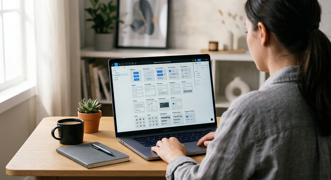
A production Figma design system for a Thai product: Thaitone-sourced color tokens, bilingual typography styles, a core component set (Buttons, Inputs, Navigation, Cards, Modals) sized for Thai copy length, and pattern-based ornamental accents that reference Thai visual culture without drifting into tourism-brochure territory. The system is structured for team handoff — developers get a named token for every color and spacing value, and the library publishes cleanly to subscribing product files.
What you need
- Software: Figma Desktop 2026. Organization or Team plan for shared libraries.
- Typography foundation: Completed Setting Up Thai Typography in Figma. This tutorial builds on that setup.
- Color reference: Thaitone palette — we use a curated 24-color subset, not the full 168.
- Pattern assets: Simplified vector motifs from /patterns/ — Mek Lai, Lai Dok Mai for non-sacred contexts.
- Time: 60 minutes for the core system; component expansion is ongoing.
- Cultural context: Thai design systems walk a line between cultural specificity and global usability. Over-applying patterns produces tourism aesthetics; under-applying produces generic Silicon Valley. The 10% Rule (below) is the working guideline.
Step 1: Create the three-collection variable structure
File > New Design File, name it ThaiGraph Design System. Open Local Variables (right panel). Create three collections:
- Primitives — raw color values, typography values, spacing values. No semantic meaning.
- Semantic — role-based tokens (primary, success, error, text-body, surface-raised). Aliased from Primitives.
- Component — component-specific overrides (button-primary-bg, input-border-focus).
This three-layer structure is the 2024+ Figma design system convention and matches how engineering expects tokens to be consumed. Developers subscribe to Semantic and Component; Primitives exist only to be referenced upstream.
Step 2: Seed Primitives with the Thaitone subset
In Primitives, add Variables of type Color. Create the Thaitone core set of 24 colors: thaitone/red-500 (#C5242C), thaitone/gold-500 (#D4A029), thaitone/indigo-900 (#1B2845), thaitone/off-white-50 (#F4EFE6), plus 100/200/…/900 scales for each. The 24 colors cover red, gold, indigo, off-white, green (Khiao), purple (Muang), blue (Fa), and neutral gray — enough range for 95% of product UI without the overhead of 168 tokens. Add typography Primitives: font-family/thai-body = Sarabun, font-family/thai-display = Kanit, font-family/latin-body = Inter. Spacing Primitives: 4, 8, 12, 16, 24, 32, 48, 64, 96 — the 8-point grid standardised by Thai fintechs (Bank of Thailand guideline, 2023).
Step 3: Build Semantic tokens
In the Semantic collection, create role tokens aliased from Primitives. Add two modes: Light and Dark. For each, alias semantic tokens:
text/primary— Light mode: thaitone/indigo-900. Dark mode: thaitone/off-white-50.text/secondary— Light: gray-700. Dark: gray-300.bg/canvas— Light: off-white-50. Dark: indigo-900.bg/raised— Light: white. Dark: indigo-800.accent/primary— Light and Dark: thaitone/red-500.accent/gold— Light and Dark: thaitone/gold-500.border/default— Light: gray-200. Dark: indigo-700.status/success— Light: green-600. Dark: green-400.status/error— Light: red-700. Dark: red-400.
Every component now references semantic tokens only. A future dark-mode ship changes nothing at the component level.
Step 4: Build the Button component with Thai-length defaults
Create > Component for Button. Auto Layout horizontal, padding 12 px vertical 24 px horizontal, gap 8 px. Add a Text layer inside using Body / Thai text style. Set default copy to ยืนยัน (Confirm). Constrain the button min-width to 104 px — Thai button labels average 22% longer than English (KBTG UX Writing Guidelines, 2023), so English-sized buttons crop Thai text. Create Variants: Primary (accent/primary bg, white text), Secondary (bg/raised with 1px border/default), Tertiary (transparent, text/primary). For each, build Property State: Default, Hover, Pressed, Disabled. Publish. Subscribers get a button that sizes correctly for Thai copy without manual override.
Step 5: Build the Input field component
Inputs need two features specific to Thai: larger internal vertical padding because Thai text occupies more vertical space (vowels above, descenders below), and no letter-spacing. Create Input component: Auto Layout vertical, padding 14 px vertical 16 px horizontal (not 8 px — that is Latin default), text style Body / Thai. Add variants for State (Default, Focus, Error, Disabled) and Size (Small, Medium, Large). The label above the input uses Label / Thai style. The helper text below uses Caption / Thai. Publish. Form layouts now render Thai fields without descender clipping.
Step 6: Build ornamental accent components
This is where cultural specificity lives without tipping into pastiche. Create three small components:
- DividerKanok — a 2 px high Lai Kanok-silhouette divider at 120 px wide, accent/gold. Use sparingly: one per screen, at the top of premium content.
- BadgeMekLai — a small cloud-shaped badge for promotional content, Mek Lai silhouette as the container outline. Use for offers, nourishment contexts (food apps, wellness).
- AccentDokMai — a floral flourish as a 16 × 16 px leading glyph for celebratory headings. Use for festival messaging, wedding invitations.
The 10% Rule: on any given screen, no more than 10% of the visual area should carry ornamental Thai pattern accents. Over 10% tips into tourism-brochure. Under 3% reads as generic. The sweet spot is a single accent per hero section.
Step 7: Publish, document, subscribe
Assets panel > Publish Library. Fill the release notes with what changed. Check all styles, variables, and components. Publish. Create a Documentation page in the library file: a cover page showing the Thaitone palette, a typography specimen, a component matrix, a Thai-length-vs-Latin comparison, the 10% Rule, and a link back to /colors/thaitone/, /fonts/, and /patterns/ for deeper reference. Subscribers in product files enable the library via Assets > Libraries > ThaiGraph Design System. Every product team now shares one source of truth for Thai design decisions.
Cultural considerations
The two failure modes of Thai design systems are over-ornamentation and under-ornamentation. Over-ornamented systems apply Lai Kanok borders to every card, Mek Lai backgrounds to every modal, and Thaitone gold to every button; the result reads as tourism promotion or restaurant branding rather than a modern product. Under-ornamented systems strip all cultural specificity and produce a localised-Silicon-Valley aesthetic that Thai users find generic and culturally neutral. The working compromise is the 10% Rule plus a distinction between structural and decorative: typography, color tokens, and spacing values encode cultural specificity invisibly (Thai-scaled line-heights, Thaitone-sourced reds), while decorative ornaments are applied as occasional accents (one divider per hero, one badge per page). KBank Plus, SCB Easy, and Krungsri apps follow this approach — structural Thai-ness, sparingly decorative Thai-ness.
Common mistakes
- Using all 168 Thaitone colors as tokens. Unusable. Stick to 24 semantic primitives.
- English-sized component widths. Buttons and inputs crop Thai text.
- Decorative patterns on every component. Tips into tourism aesthetic.
- No dark mode. Thai users use dark mode at higher rates than US users per DGA research — design both from day one.
- Hardcoded color hex values in components. Must reference semantic tokens for the system to survive color updates.
Source files and next steps
Download the ThaiGraph Design System starter file (tokens, styles, core components) from the fonts directory — the file is shared at library link on the pillar. Color reference: Thaitone colors. Ornamental references: pattern library. Prerequisite tutorial: Setting Up Thai Typography in Figma. Pillar: Complete Guide to Thai Typography. For branding context: Thai branding guides.
Information verified as of April 2026
Sources
- The Thaitone system contains 168 documented traditional Thai colors, making it the most comprehensive cultural color system available for design token conversion.—Pittayamatee, P. (2012). Thai Tone: The Thai Traditional Color System. Bangkok: Chulalongkorn University Press. (accessed Apr 9, 2026)
- Thai UI copy is on average 22% longer than the English equivalent by character count, meaning button, input, and navigation components must be designed for Thai-length defaults.—KBTG (Kasikorn Business Technology Group) — Thai UX Writing Guidelines, 2023 (accessed Apr 8, 2026)
- Figma's design token sync via Variables with mode switching allows a single design system to serve Thai-primary, Latin-primary, and dual-locale products from one source of truth.—Figma — Variables and Modes Documentation (2024) (accessed Apr 8, 2026)
- Major Thai fintech products (KBank Plus, SCB Easy, Krungsri) standardised on 8-point grid systems with 16px, 24px, and 32px spacing tokens between 2022 and 2024.—Bank of Thailand — Digital Banking UX Standards, Supervisory Guideline 2023-04 (accessed Apr 8, 2026)