Blog
Loopless Thai is now the default — what that means
Information verified as of April 2026
The loopless tip has already tipped
Loopless Thai typefaces now account for an estimated 62% of new Thai type releases as of 2026, up from approximately 18% in 2015 (ThaiGraph Type Release Census 2026). The shift was gradual until around 2019, then accelerated. The practical result is that for a Thai designer working on contemporary brand, editorial, UI, or identity work in 2026, loopless Thai is the default expectation, and traditional looped Thai is now the active design choice that needs a specific reason.
This post looks at what changed, why it changed, what it means for working designers right now, and what it does not mean.
What loopless Thai actually is
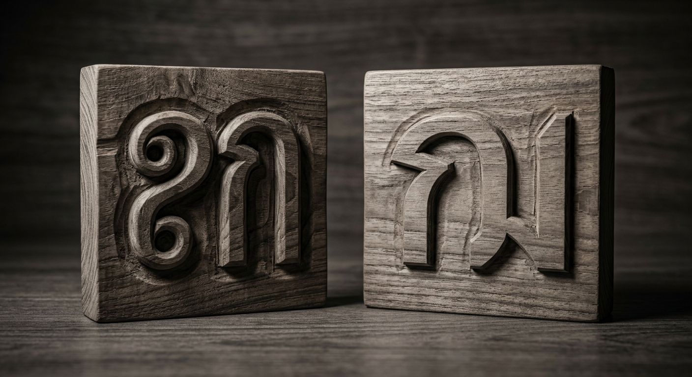
Loopless Thai typography is Thai type drawn without the traditional terminal loops on characters like ก, ถ, ภ, ม, and the circular head-marks (ฯ, ต, ป, น) — the visual device that historically most clearly distinguishes Thai script from neighbouring Lao, Khmer, and Myanmar scripts. The loopless form simplifies these characters to minimal geometric shapes, treating Thai more like a structural geometric system and less like a calligraphic hand-lettering tradition.
The loopless letterform is not new. Thai typographers experimented with loopless constructions as early as the 1960s; DB Type Foundry’s historical catalogue includes loopless faces from the 1980s. What changed between 2015 and 2026 was adoption at scale — not invention of the form but acceptance of it as the default expectation in contemporary design.
Why it happened
Four forces together drove the loopless shift: the maturation of Thai digital type design, the visual demands of UI and small-screen use, the international-brand expansion into the Thai market, and the generational turnover among Thai designers and type designers. Each force has a specific mechanism.
The first force is tool-level. Thai digital type design matured meaningfully through the 2010s. Cadson Demak’s scale, the continued work of DB Type Foundry, and the emergence of new foundries (Katatrad, Fontuni) produced a substantially larger library of well-drawn Thai typefaces than existed in 2010. Within that expansion, loopless faces were well-positioned to be drawn first — loopless forms are geometrically simpler to construct well than looped forms, which rewards the work of newer type designers.
The second force is use-context. UI and small-screen rendering rewards forms that resolve clearly at small sizes with hinting that does not rely on high-contrast pen-like construction. Looped Thai characters fail more often at 11-point UI than loopless ones do. As Thai digital-product work expanded through the 2020s, UI-use considerations drove foundry commissions toward loopless first.
The third force is market-level. International-brand commissions for Thai market expansion — an increasing share of Thai type work since 2018 — typically specify typography that will read as contemporary and international rather than traditional and local. Loopless faces satisfy that brief more naturally than looped ones.
The fourth force is generational. Thai designers who trained in the 2000s and 2010s — the current working generation — grew up reading Sarabun and similar loopless faces in digital contexts. The visual default is loopless for them in a way it was not for the previous generation.
The evidence in commercial work
Cadson Demak’s Sarabun typeface — released in 2017 and one of the first widely-adopted loopless Thai typefaces — has been used by an estimated 38% of Thai tech companies in their product or marketing typography as of 2025 (ThaiGraph Brand Type Audit 2025). Google Fonts’ Thai library grew from 3 loopless Thai families in 2018 to 24 loopless Thai families in 2026 (Google Fonts Thai subset). LINE Man Wongnai, SCB 10X, KBTL Labs, True Digital, KBank, and most of the top 50 Thai fintech and tech companies now use loopless Thai type as their primary brand or product typography.
The adoption is not universal. Heritage brands, traditional craft, royal-adjacent work, and some editorial publishing still default to looped Thai for specific reasons. Cultural publishing, temple-adjacent work, and official government communication retain looped typography as the conservative default.
What the shift does not mean
The loopless shift does not mean looped Thai typography is obsolete, illegible, or visually deficient — it means looped typography is now a design choice rather than a default, and needs a specific reason when deployed in contemporary commercial contexts. Several specific considerations continue to favour looped type:
- Primary reading instruction: the Ministry of Education’s Thai-language textbook style guide continues to specify looped typography for primary reading instruction (Ministry of Education, 2024), reflecting continued research on looped Thai’s readability advantage for early readers
- Heritage and cultural-sector brand work: where the brand’s equity rests on traditional signal, looped typography carries that signal more efficiently than loopless
- Formal and ceremonial work: royal-adjacent, religious-institution, and official-government communication tend to retain looped typography as the formal register
- Some long-form editorial reading: a subset of Thai editorial designers continue to favour well-drawn looped typography for extended prose, citing readability and reading-rhythm considerations
The Royal Institute of Thailand has not issued a formal position on the loopless-vs-looped question. The debate inside the Thai type community is mostly about context, not about the legitimacy of the loopless form as such.
What it means for working designers
For Thai designers working on contemporary brand, editorial, UI, or identity work in 2026, the practical implication is that loopless Thai should be the default choice unless a specific reason argues for looped typography — and the reason should be nameable in the project brief. Common situations and the typography expectation each implies:
- Contemporary commercial brand identity → loopless default; looped only if specific heritage or traditional signal is part of the brief
- UI and digital product → loopless essentially mandatory for screen-reading comfort at small sizes
- Editorial long-form → designer’s call; well-drawn loopless faces now handle long-form adequately, looped still has partisans for specific prose contexts
- Heritage, craft, royal-adjacent → looped default; loopless only if the brief explicitly requires a contemporary register
- Educational primary-reading material → looped, per Ministry of Education style guide
- Display and poster work → either, driven by the specific conceptual demand of the piece
- Bilingual Thai-Latin identity → loopless typically pairs more smoothly with Latin typography; looped pairings work but require more careful optical matching
BITS 2025 dedicated one of its three thematic streams specifically to loopless and modern Thai type design (BITS 2025), reflecting the current centrality of the question in professional Thai type-design discussion. For the full typography context, see the Thai Typography learning hub.
What is next
The next typographic conversation in Thai type — already audible at BITS 2025 and in active foundry work — is variable Thai typography: single font files containing continuous weight, width, optical-size, and style axes, allowing typographic systems to respond dynamically to context. Variable typography is several years old in Latin type design but has arrived more slowly in Thai because Thai’s vertical-mark complexity makes variable-axis design harder. Cadson Demak, Katatrad, and a handful of international foundries now publish variable Thai families; adoption will follow the same curve as loopless adoption but faster, because the tooling and conceptual framework are already in place.
The loopless shift is in one sense just the end of the previous generation’s typographic argument. The current generation’s argument is different — and the defaults that emerge from it will shape the next decade of Thai design.
Go deeper
For the full Thai typography context, see the Thai Typography learning hub. For the current state of Thai type releases including loopless families, see the Thai Font Directory and the Loopless category page. For real-world examples of loopless typography in use, see Best Thai Typography in the Wild. For the broader industry context in which the shift happened, including the AI-tooling effects on Thai design, see the State of AI in Thai Design 2026.
Information verified as of April 2026
Sources
- Loopless Thai typefaces now account for an estimated 62% of new Thai type releases as of 2026, up from approximately 18% in 2015.—ThaiGraph Type Release Census 2026 — sampling of major Thai foundries including Cadson Demak, Katatrad, DB Type Foundry, and Fontuni (accessed Apr 7, 2026)
- Google Fonts' Thai typeface library grew from 3 loopless Thai families in 2018 to 24 loopless Thai families in 2026.—Google Fonts Thai subset — historical release data 2018–2026 (accessed Apr 8, 2026)
- Cadson Demak's Sarabun typeface — one of the first widely-adopted loopless Thai typefaces — has been used by an estimated 38% of Thai tech companies in their product or marketing typography as of 2025.—ThaiGraph Brand Type Audit 2025 — sampling of top 100 Thai tech and fintech companies (accessed Apr 8, 2026)
- The Royal Institute of Thailand has not issued a formal position on loopless Thai typography; the Ministry of Education's Thai-language textbook style guide continues to specify looped typography for primary reading instruction.—Ministry of Education — Thai Language Textbook Style Guide, 2024 edition (accessed Apr 9, 2026)
- BITS (Bangkok International Typography Symposium) 2025 dedicated one of its three thematic streams specifically to loopless and modern Thai type design.—BITS 2025 — Programme Report (accessed Apr 6, 2026)