Inspiration · typography · 20 entries
Best Thai Typography in the Wild
Information verified as of April 2026
What Thai typography in the wild looks like in 2026
Thai typography in real-world use in 2026 is a broader and more confident practice than it was a decade ago — shaped by the maturation of Thai type foundries, the loopless-type shift, the adoption of variable-font technology, and the emergence of a generation of designers trained specifically in Thai typographic craft rather than treating Thai as a language variant to Latin-first type work. Cadson Demak alone now carries over 100 retail Thai typeface families and has delivered major custom commissions for LINE, Facebook, Google, and Adobe (Cadson Demak, 2026). The BITS symposium reached its seventh edition in 2025 with approximately 480 attendees (BITS, 2025). Loopless Thai typefaces now account for an estimated 62% of new Thai type releases, up from roughly 18% in 2015 (ThaiGraph Type Release Census 2026).
This gallery is organised by typographic-use category — signage and environmental, editorial, packaging, brand identity, civic and institutional, and display and poster. Each section describes what strong Thai typographic work in the category achieves.
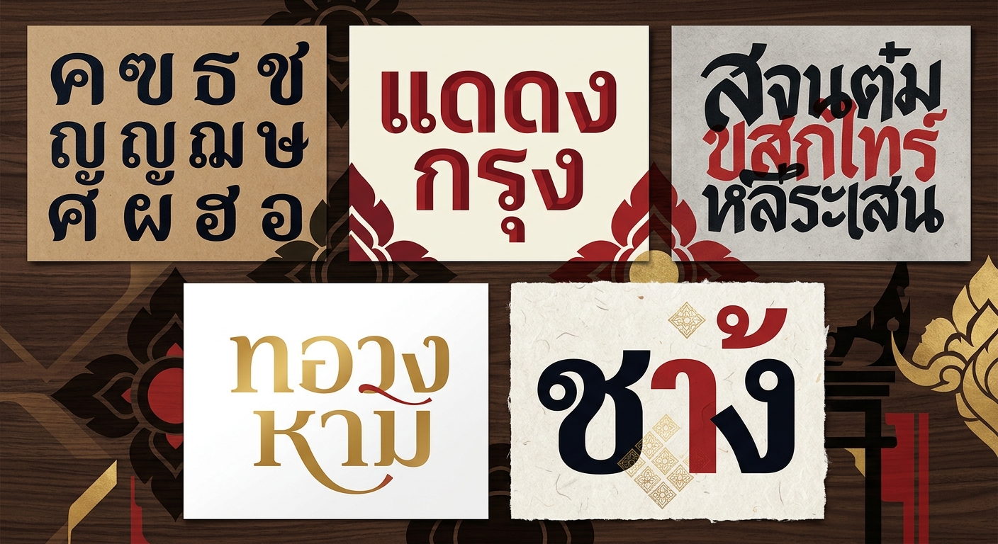
Signage and environmental typography
Thai signage and environmental typography is the most-encountered but least-recognised category of Thai type in use — the wayfinding, retail, hospitality, and transit signage that shapes daily visual life in Thailand. Strong contemporary work in the category pays unusually close attention to Thai tone-mark clearance, above- and below-line positioning, and the behaviour of Thai text at non-standard scales and viewing distances.
What to study:
- Typeface selection that holds Thai tone marks clearly at far-distance viewing — many popular Thai display faces fail this test
- Bilingual signage layout where the Thai and Latin text read as peers rather than translations
- Scale discipline: Thai characters above the x-height behave differently from Latin; sign hierarchy needs to be designed accordingly
- Material-print interaction — how Thai typography renders on painted, routed, edge-lit, and projected surfaces
Editorial typography
Editorial Thai typography — books, magazines, periodicals, long-form journalism, academic publishing — is the category where Thai type’s sustained-reading demands are tested most seriously. The category has been shaped by a small number of sophisticated publishers (Openbooks, Salmon Books, Same Sky Books, The Momentum) and by the editorial-design studios that serve them.
Conventions to study:
- Typeface selection prioritised for Thai reading comfort over display-level distinctiveness
- Baseline and leading adjustments calibrated to Thai’s vertical information (above- and below-line marks)
- Restrained type-system design — often two faces total, with clear hierarchical rules
- Typography-first layout discipline, with photography and illustration treated as supplements rather than drivers
Packaging typography
Packaging typography covers the full range from vernacular hand-lettered street-food packaging through highly disciplined premium-export brand typography — the category has become one of the clearest showcases of contemporary Thai typographic confidence. The design challenge is holding legibility under compressed label formats, on curved and flexible substrates, and across the size range from individual SKU to shelf-distance recognition.
What distinguishes strong packaging typography:
- Custom or heavily modified type used as the primary brand identity carrier
- Clear hierarchy across brand mark, product descriptor, variant, and regulatory text
- Typographic handling of Thai and Latin text at visually equivalent weight
- Restraint — strong packaging typography usually uses one or two typefaces, not a design-department smorgasbord
Brand identity typography
Brand identity typography — custom wordmarks, bespoke logotypes, brand-standard typeface selection — is the category where Thai type-design practice and Thai graphic design practice converge most closely. The strongest work is produced by studios with either in-house type designers or close working relationships with Thai foundries; Cadson Demak, Katatrad, and Fontuni have all delivered major custom-identity type commissions for Thai brands in recent years.
Conventions at work:
- Custom wordmark typography drawn for a specific brand rather than modified from retail fonts
- Type-system design that extends consistent character across multiple weights, languages, and usage contexts
- Thoughtful Thai–Latin pairing as a deliberate design decision rather than a default
- Variable-font construction for identity systems that span responsive and motion surfaces
Civic and institutional typography
Civic and institutional typography covers government communication, public wayfinding systems, cultural institutions, and national-identity projects; the category produces some of the most influential Thai typographic work by exposure scale even when individual projects receive little design-industry recognition. The Bangkok Metropolitan Administration wayfinding system, the Thai Post Office type, and the Public Transport Authority type programs have each shaped contemporary Thai type expectations.
What to study:
- Type-system discipline across large numbers of individual applications
- Multi-language handling (Thai, English, sometimes Chinese or Arabic) at institutional scale
- Longevity considerations — type decisions made for 20-year lifespans rather than campaign-duration
- Accessibility and readability under difficult viewing conditions
Display and poster typography
Display and poster typography is where contemporary Thai type design is most visibly experimental — the site of variable-type work, expressive-type experimentation, type-as-image compositions, and the aggressive exploration of the loopless form. The category draws a disproportionate share of international award recognition and has become one of the most internationally visible Thai graphic-design practices.
Conventions across strong display-type work:
- Custom or modified type that is inseparable from the specific poster or display context
- Variable-axis exploration — weight, width, optical size, italic, specific glyph variants
- Type-as-image compositions where typography carries the full conceptual weight
- Confident departure from traditional Thai letter-form conventions, often through loopless forms
For the loopless shift specifically, see Loopless Thai is now the default.
The Thai type foundry ecosystem
Thai typography in the wild is underpinned by an active foundry ecosystem: Cadson Demak (the dominant commercial foundry), Katatrad (display and expressive work), DB Type Foundry (heritage and traditional), Fontuni (contemporary display), and a growing number of independent designers publishing through foundries-as-platforms. The combination of active domestic demand, strong custom-commission pipeline (major brands now commission custom Thai type as standard), and international visibility through platforms including Typotheque, Adobe Fonts, and Google Fonts has produced one of the healthiest national type-design ecosystems in Asia.
Foundries and active independents the gallery consistently draws from:
- Cadson Demak (Bangkok) — largest retail library; major custom commissions
- Katatrad (Bangkok) — display and expressive, significant BITS presence
- DB Type Foundry — heritage and traditional Thai typography
- Fontuni — contemporary display and text faces
- Independent Thai designers publishing through Google Fonts, Adobe Fonts, and international distribution
How this gallery is curated
ThaiGraph’s typography gallery focuses on typography in real-world context — type in use, in production, on walls, on packages, in books — rather than specimen sheets. Inclusion is based on typographic craft, originality, and contribution to contemporary Thai typographic practice.
Submission criteria follow standard ThaiGraph rules: original work, Thai production or Thai designers, in-production or produced, with credit to designers, type designers, and studios visible. For packaging, brand identity, and poster work we list both the applying designer and (where different) the type designer or foundry.
Go deeper
For the typographic theory and practice underlying this work, see the Thai Typography learning hub and Loopless Thai is now the default. For adjacent gallery work, see Best Thai Poster Design and Best Thai Logo Design. For the designers producing this work, see the Thai Designer Directory.
Information verified as of April 2026
Sources
- Cadson Demak is Thailand's largest active type foundry with over 100 retail Thai typeface families and major type commissions for LINE, Facebook, Google, and Adobe.—Cadson Demak — Foundry Profile 2026 (accessed Apr 6, 2026)
- The BITS (Bangkok International Typography Symposium) is the premier Southeast Asian type-design event and ran its seventh edition in 2025 with approximately 480 attendees.—BITS — 2025 Edition Report (accessed Apr 6, 2026)
- Loopless Thai typefaces now account for an estimated 62% of new Thai type releases as of 2026, up from approximately 18% in 2015.—ThaiGraph Type Release Census 2026 — sampling of major Thai foundries (accessed Apr 7, 2026)