Thai font · OFL
Noto Sans Thai
โนโต แซนส์ ไทย
Information verified as of April 2026
What Noto Sans Thai is
Noto Sans Thai is the Thai script member of Google and Adobe’s Noto family, the global type project that aims to cover every Unicode script with matched, harmonised sans-serif and serif typefaces. It ships in two cuts — Noto Sans Thai (loopless) and Noto Sans Thai Looped — across nine weights each.
The Noto project began in 2012 to eliminate the “tofu” fallback boxes that appear when a script has no installed font. For Thai, that work produced a neutral, web-safe sans with extensive hinting and a strict cap-height alignment to the rest of the Noto Sans family.
In production, Noto Sans Thai is the default Thai web font on Android, the default Thai system font on Chrome OS, and the baseline fallback on most CSS font-family stacks that target Thai users. If you do nothing else, Noto Sans Thai is already doing the work.
Character design and tone
Noto Sans Thai is deliberately neutral — a workmanlike sans designed to render cleanly at every screen size and under every hinting condition rather than to express personality. The loopless cut uses open hooks on ก, ถ, ภ; the looped cut restores the traditional circular heads for contexts where Thai readers expect them.
X-height is moderate — neither as tall as Kanit nor as compact as TH Sarabun PSK. Stroke contrast is low but not zero; curves have a slight optical taper at joins. Tone marks sit conservatively above the baseline, giving comfortable room for ascenders on ป, ฝ and ฟ.
The Latin companion is Noto Sans itself, which means Thai and Latin align at cap height, x-height, and stroke weight. This matters more than it sounds: a lot of Thai web pages mix Thai and English in the same sentence, and Noto is the easiest way to make that mix feel coherent.
Weights and availability
Noto Sans Thai ships nine weights from Thin (100) to Black (900), matched by a Looped variant with identical weight coverage. Italic cuts and condensed variants exist for some weights.
Download from Google Fonts or the Noto GitHub repository. Variable font files are available, which consolidate all weights into a single ~200KB file.
The wider Noto family covers Noto Serif Thai, Noto Sans Thai Looped and a Thai-supporting Noto Color Emoji set, so a full design system can be built from Noto alone.
How to download Noto Sans Thai
Noto Sans Thai is a free download from Google Fonts — take the full family ZIP with all nine static weights (including SemiBold, Bold, and Black), or the single variable-font file that covers the whole 100–900 range. No registration or payment is required under the SIL Open Font License.
Three ways to get it:
- Google Fonts download — open the Noto Sans Thai specimen, click “Get font”, and download the family ZIP. The individual static weights are inside.
- Google Fonts embed — fastest for the web: load
https://fonts.googleapis.com/css2?family=Noto+Sans+Thai:[email protected]&display=swapin a<link>tag, then setfont-family: 'Noto Sans Thai', sans-serif;in your CSS. - GitHub source — the Noto Thai repository hosts the source files and hinted/unhinted builds for self-hosting.
For the traditional looped cut, download Noto Sans Thai Looped — a separate Google Fonts family with the same nine weights and the same licence.
Best use cases
Noto Sans Thai is the correct default when neutrality, multilingual coverage, and technical reliability matter more than brand personality. Strong briefs:
- International websites with Thai as one of many supported languages
- Android app UI targeting Thai users — the font is already installed
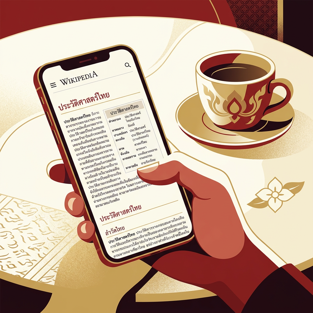
- Wikipedia-style reference content, documentation, and knowledge bases
- Email newsletters and transactional messages where cross-client rendering matters
- Academic publications and research papers with mixed Thai-English-Latin content
Where it doesn’t fit: Thai-focused consumer brands that want character (Kanit, Prompt, Bai Jamjuree all beat it), luxury and editorial work, and any context where “default” is not the desired tone.
Pairings
Noto Sans Thai pairs with the rest of the Noto family by design, but also works with external Latin sans. Three pairings:
- Noto Serif Thai — for headline/body pairing inside a single harmonised system, see Noto Serif Thai
- Inter — when you want a sharper Latin than Noto Sans, with matching humanist proportions
- Source Sans 3 — Adobe’s sibling sans, identical tone of voice
See the fonts directory for the full catalogue.
Licensing
Noto Sans Thai is released under the SIL Open Font License with all weights free for commercial use, modification, and bundling. Both the loopless and looped cuts share the same licence terms. Verify at the Google Fonts specimen or the Noto GitHub repo. No paid tier exists.
Information verified as of April 2026
Sources
- Noto Sans Thai is part of the Noto typeface family, a joint project between Google and Adobe to provide harmonised type coverage for all Unicode scripts.—Google Noto Fonts project site (accessed Apr 10, 2026)
- Noto Sans Thai and Noto Sans Thai Looped are both released under the SIL Open Font License and available on Google Fonts.—Google Fonts specimen page for Noto Sans Thai (accessed Apr 10, 2026)