Inspiration · logos · 25 entries
Best Thai Logo Design
Information verified as of April 2026
What Thai logo design is doing in 2026
Thai logo design has shifted materially in the last decade — away from ornament-led and pattern-integrated logos and toward typographic, structural, and restrained wordmark-first work that holds up alongside contemporary international logo practice. The strongest Thai studios now deliver custom Thai wordmarks at a craft level equal to the best international type-design practice; Thai logo and identity work won 19 international brand-identity awards across Red Dot, iF, and A’ Design between 2022 and 2025 (ThaiGraph aggregated analysis). The shift is visible across every sector where logo design is a meaningful part of the brief.
This gallery is organised by logo type — Thai wordmarks and custom lettering, monograms, pictorial marks, abstract and geometric marks, combination marks, and bilingual (Thai–Latin) systems. Each section describes what strong work in the category achieves.
Thai wordmarks and custom lettering
The Thai wordmark — custom-drawn Thai typography functioning as the primary brand mark — is now the dominant form of premium Thai logo work and is the category where Thai design most clearly competes with international type-design at the highest level. Custom Thai wordmark design for major brand commissions typically runs 80–200 hours of type-design work; commissions at identity-system level price between THB 120,000 and THB 450,000 (ThaiGraph Studio Pricing Survey 2026).
What distinguishes strong Thai wordmark work:
- Character-by-character type-design craft, not type-modification from retail fonts
- Proportion system that holds across multiple weights if the wordmark is extended into a family
- Tone-mark and above-line handling integrated with the mark’s optical balance
- Optional Latin wordmark drawn to visually match, not translated across directly
The designers and foundries doing most of this work commercially are concentrated in Cadson Demak and a small number of top Bangkok studios; individual type designers are also taking increasing wordmark commissions directly.
Monograms
Thai monograms — logos built from one or two stylised Thai or Latin characters — are a common solution where a full wordmark is too long for the brand’s application context; the category ranges from restrained single-letter marks for hospitality and fashion brands to elaborate calligraphic monograms for heritage-adjacent work. The design challenge is making a small number of characters carry the full identity weight, which requires either very high-craft lettering or strong conceptual construction.
Conventions:
- Single-letter or two-letter construction where each character is fully resolved as a design object
- Geometric construction systems that produce repeatable brand extensions (pattern, secondary graphic, motif)
- Clear working-size discipline — monograms need to hold at small scale as well as at hero scale
- Material and print-finishing discipline in application (foil, blind-stamp, debossed)
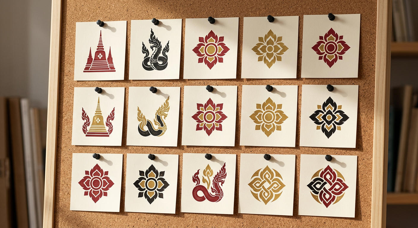
Pictorial marks
Pictorial marks — logos built around an illustrated object, character, or scene — remain a meaningful minority of Thai logo practice and are used most commonly in food-and-beverage, hospitality, and arts-and-culture identity work where character recognition is a brand asset. Strong contemporary Thai pictorial marks have moved away from literal-illustration-as-logo toward more stylised, geometric, and construction-rule-based illustration.
What to study:
- Mark construction that has a clear geometric basis rather than free-hand illustration
- Simplification discipline — strong pictorial marks work at wordmark-scale and don’t rely on illustrative detail
- Cultural-reference handling — where Thai cultural objects or scenes are referenced, the reference is clear but not pastiche
- Extension system — how the pictorial mark informs pattern, secondary graphic, and brand-asset development
Abstract and geometric marks
Abstract and geometric marks — logos built from pure geometric or abstract construction without direct representational reference — are the growing category in Thai tech, fintech, and digital-product identity work. The visual language draws from international tech-logo conventions but increasingly with Thai-specific construction logic layered in.
Conventions across strong work:
- Clear construction rule set — the mark’s geometry is principled rather than gestural
- Scaling behaviour — abstract marks need to hold across app-icon, favicon, watermark, and hero scales
- Monochrome-first design — if the mark doesn’t work in a single colour, it’s not resolved
- Extension into motion — current Thai tech marks are designed with motion behaviour as a first-class property
Combination marks
Combination marks — wordmark plus symbol — remain the most common Thai logo format by volume, especially in F&B, hospitality, and commercial categories where both the brand name and a visual anchor contribute identity weight. The design challenge is making the two elements sit together as a single mark rather than as a wordmark with a stuck-on icon.
What distinguishes strong combination marks:
- Symbol and wordmark drawn to share construction logic — similar weights, similar geometric treatment, shared optical correction
- Clear lockup rules — horizontal, stacked, reversed, reduced — that hold visual integrity across applications
- Working-size discipline — combination marks often fail at small scale where the symbol or wordmark dominates
- Relationship between symbol and wordmark that is conceptually earned, not arbitrary
Bilingual Thai–Latin systems
Bilingual logo systems — where Thai and Latin versions of the same mark need to function as peers — are a distinctly Thai logo-design challenge and the category where Thai logo practice is most clearly ahead of Western-equivalent work. Most contemporary Thai commercial brands need to operate bilingually; strong bilingual identity work holds both versions at visually equivalent weight and identity without one reading as a translation of the other.
Conventions at work:
- Thai and Latin marks drawn as a design pair, not developed sequentially
- Weight and proportion matching across scripts — Thai’s vertical ascenders and descenders behave differently from Latin’s x-height system
- Colour and material decisions that hold identically across the two scripts
- Lockup system that accommodates both-languages usage as well as single-language usage
What makes Thai logo work distinctive
The single clearest contribution of Thai logo design to contemporary international practice is the sophistication of bilingual Thai–Latin wordmark systems — an area where Thai type designers and identity designers have built a practical craft no single-script national tradition has needed to develop. The secondary contributions are the specific Thai confidence with colour in identity systems and the increasingly refined loopless-Thai letter-form vocabulary.
Three patterns in contemporary Thai logo work worth studying:
- The move from ornament-led to type-led identity — reflecting both the generational shift among Thai designers and the changed expectations of Thai clients
- The maturation of loopless Thai letterforms at wordmark scale — earlier loopless faces worked at display scale but often failed in logo applications; current generation reliably holds
- The integration of Thai type designers directly into identity commissions at the conception stage rather than as retail-font suppliers after the fact
How this gallery is curated
ThaiGraph’s logo gallery is curated from public submissions, award archives, studio portfolios, and direct studio outreach; inclusion requires craft, originality, and contribution to the contemporary Thai logo-design conversation. Submission rules are the same as ThaiGraph’s other inspiration galleries: original work, Thai designers or Thai production, with full credit to the designer, studio, and (where relevant) the type designer or foundry who produced the custom wordmark lettering.
Submissions are reviewed monthly. Inclusion of international brands designed for Thai market expansion is accepted where the work was produced by a Thai studio or where a Thai type designer produced the wordmark lettering.
Go deeper
For the full identity systems that logos anchor, see Best Thai Brand Identity Work. For the typography that underlies strong Thai wordmarks, see Best Thai Typography in the Wild. For the designers producing this work, see the Thai Designer Directory. For the studios, see the Thai Studio Directory.
Information verified as of April 2026
Sources
- Thai logo and identity work won 19 international brand-identity awards across Red Dot, iF, and A' Design between 2022 and 2025.—ThaiGraph aggregated analysis of Red Dot, iF, and A' Design brand-identity and corporate-design categories 2022–2025 (accessed Apr 4, 2026)
- Custom Thai wordmark design for major brand commissions typically runs 80–200 hours of type design work, with custom Thai wordmark commissions priced between THB 120,000 and THB 450,000 for identity-system-level work.—ThaiGraph Studio Pricing Survey 2026 — 32 member firms (accessed Apr 6, 2026)
- Thai logo design competitions run annually through ThaiGa and Thai Design Graphic Award; the dedicated logo category received approximately 340 entries in 2025.—ThaiGa — Thai Design Graphic Award 2025 Entry Report (accessed Apr 3, 2026)