Thai font · OFL
Itim
อิทิม
Information verified as of April 2026
What Itim is
Itim is a friendly, hand-drawn display Thai typeface from Cadson Demak with rounded letterforms and a warm, informal tone that sits between a formal script and a standard sans-serif. It ships as a single Regular weight under the SIL Open Font License on Google Fonts.
Where most Cadson Demak releases are full families with multiple weights, Itim is deliberately a one-shot display face. The single weight is calibrated for headline and short-text use at 20-60pt, where its hand-drawn quality reads clearly without fatiguing the eye.
In the ecosystem of free Thai fonts, Itim fills a specific gap: a face that feels hand-lettered and approachable without being a full cursive script. It is the Thai equivalent of something like Fredoka or Quicksand — soft, round, and unmistakably friendly.
Character design and tone
Itim uses softly rounded stem terminals, slightly irregular curves that mimic hand-lettering, and looped consonants with a gentle informal tone. Unlike strict loopless faces, Itim keeps the traditional circular heads on ก, ถ, ภ, which makes it feel more cultural and less corporate.
The irregularity is deliberate but subtle — letters do not look mechanical, but they are consistent enough to read smoothly. Stem weights vary very slightly across the alphabet in the way hand-lettered work naturally does. Curves on ถ and ภ are near-circular rather than elliptical, reinforcing the rounded friendly tone.
Tone marks and vowel signs share the rounded character, with small terminals and soft curves rather than sharp points. The Latin companion is a humanist rounded sans with similar soft tone — in the neighbourhood of Nunito or Quicksand, but with more visible hand-drawn character.
Weights and availability
Itim ships only one weight — Regular — with no italic, light, or bold cuts. Download from Google Fonts or the Cadson Demak catalogue.
File size is approximately 50-65KB in WOFF2 with Thai + Latin subset. The single-weight constraint means Itim is usually paired with a fuller-family companion (Sarabun, Mitr, or Prompt) that can handle the weight range the layout needs.
Best use cases
Itim is the right Thai font when a project needs hand-drawn friendliness and approachability. Strong briefs:
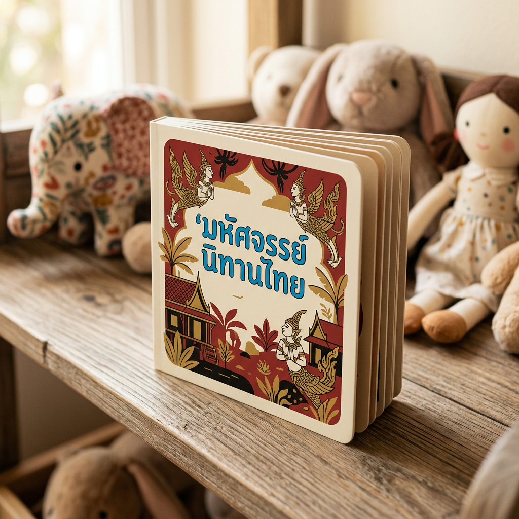
- Children’s book and education publishing — workbooks, primary-school posters
- Toy, nursery, and family-product branding and packaging
- Bakery, dessert, and candy brand logos and display headlines
- Community event posters — school fairs, neighbourhood festivals, farmer’s markets
- Casual cafe and home-style restaurant branding
Where it doesn’t fit: any body text use, corporate communications, luxury branding (reach for Charm or Pridi), and UI where neutrality matters more than warmth.
Pairings
Itim pairs with neutral Thai body sans that let its display personality breathe. Three pairings:
- Sarabun — clean Thai body for paragraphs under Itim display headlines
- Quicksand — Latin rounded sans with matching warm tone for bilingual work
- Nunito — softly rounded Latin sans for body copy with Itim titles
See /fonts/ for more display options.
Licensing
Itim is released under the SIL Open Font License and is free for commercial use, modification, and bundling provided the OFL notice travels with the file. Verify at the Google Fonts specimen or the Cadson Demak catalogue. Use in children’s products, packaging, and commercial print requires no additional permission.
Information verified as of April 2026
Sources
- Itim was designed by Cadson Demak and is distributed on Google Fonts under the SIL Open Font License.—Google Fonts specimen page for Itim (accessed Apr 10, 2026)
- Itim is a single-weight friendly display Thai typeface with a hand-drawn, informal tone.—Cadson Demak catalogue entry for Itim (accessed Apr 10, 2026)