Thai font · OFL
Mitr
มิตร
Information verified as of April 2026
What Mitr is
Mitr is a humanist loopless Thai sans-serif from Cadson Demak, designed as a softer, more bookish alternative to the firm’s own Kanit and Prompt. The name means “friend” in Thai (มิตร), and the design follows through with six weights of warm, open letterforms released free under the SIL Open Font License on Google Fonts.
Where Kanit is a geometric workhorse and Prompt is its rounder cousin, Mitr leans further into humanist territory — the strokes breathe like they were drawn with a broad pen rather than constructed on a grid. It still drops the traditional loops on consonants, but the overall feeling is closer to Avenir or Gotham than to Futura.
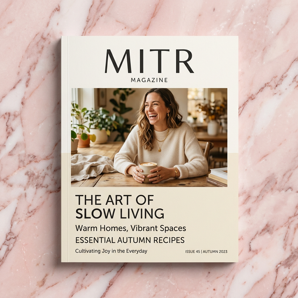
In commercial use, Mitr shows up on brands that want the modernity of loopless Thai without the coldness that sometimes comes with geometric faces. Wellness, hospitality, arts and culture, and editorial brands are its natural home.
Character design and tone
Mitr uses a moderate x-height, slightly modulated strokes, and gently angled terminals that echo hand-drawn letterforms more than geometric construction. The head of ก is an open curve with a subtle hook — friendlier than Kanit’s cleaner opening but still firmly loopless.
Stroke contrast is present but subtle: verticals on น, บ, ป carry slightly more weight than the joining strokes, giving the page a gentle rhythm. Bowls on ถ and ภ are drawn with a distinct humanist tilt, as though a calligrapher adjusted the pen angle mid-stroke. Thai tone marks and vowel signs match the stroke modulation, so the overall page texture stays cohesive.
The Latin companion is a humanist sans with two-storey a, slightly flared stems and wider counters than Kanit’s Latin. Numerals are lining and align to cap height. The Latin reads as a cousin of Source Sans 3 with a hint of Lato warmth.
Weights and availability
Mitr ships six weights from ExtraLight (200) to Bold (700) in upright only — no italic cuts are currently released. Download from Google Fonts or the Cadson Demak catalogue.
File sizes are roughly 40-55KB per weight in WOFF2 with the Thai + Latin subset. For production deployments, a three-weight loadout (Light, Regular, SemiBold) handles most editorial layouts at under 170KB total.
Best use cases
Mitr earns its place on editorial-feeling consumer brands and on body copy where a warmer loopless sans out-performs Sarabun’s neutrality. Strong briefs:
- Boutique travel, hospitality and wellness brands (spa, yoga, retreat)
- Non-profit and cultural institution branding (museums, arts festivals, heritage)
- Editorial blog and magazine layouts needing a modern but human voice
- Skincare and beauty packaging targeting a mid-premium market
- Independent coffee and craft F&B where the brand wants approachable modernity
Where it doesn’t fit: heavy UI work (Kanit, Prompt or IBM Plex are cleaner at 12-14px), government documents (Sarabun is the expected default), and display-heavy luxury (reach for Pridi or Charm).
Pairings
Mitr pairs best with humanist Latin sans and transitional serifs that share its warmth. Three pairings:
- Source Sans 3 — similar humanist skeleton with matching x-height, good Thai-English editorial pair
- Lato — same friendly tone with slightly narrower proportions, good for magazine-style layouts
- Lora — humanist serif for body text when Mitr handles the headlines
See /fonts/ for the full pairings matrix.
Licensing
Mitr is released under the SIL Open Font License and can be used commercially, modified, and bundled in products provided the OFL notice travels with the file. Verify at the Google Fonts specimen or the Cadson Demak catalogue entry. No paid tier exists.
Information verified as of April 2026
Sources
- Mitr was designed by Cadson Demak and is distributed on Google Fonts under the SIL Open Font License.—Google Fonts specimen page for Mitr (accessed Apr 10, 2026)
- Mitr ships in six weights from ExtraLight to Bold and supports Thai and Latin scripts.—Cadson Demak catalogue entry for Mitr (accessed Apr 10, 2026)