Thai font · OFL
Pridi
ปรีดี
Information verified as of April 2026
What Pridi is
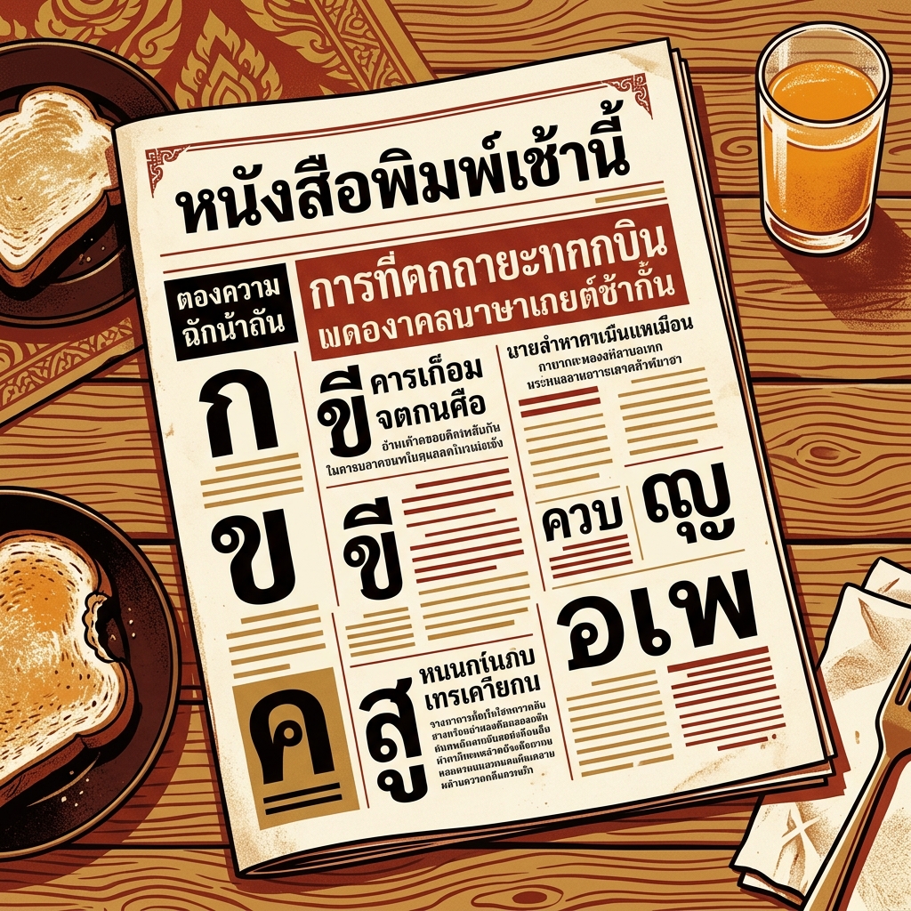
Pridi is an editorial Thai serif from Cadson Demak with strong literary character — higher contrast than Niramit, more restrained than Charm, designed specifically for book typography and long-form reading. It ships six weights under the SIL Open Font License on Google Fonts.
The name evokes a Thai literary register — Pridi Banomyong was one of Thailand’s most significant twentieth-century intellectuals, and the font’s tone matches that associative weight. The design is deliberately bookish: measured contrast, looped consonants, and terminals drawn with the care of a typeface meant to live on a page rather than a poster.
Among free Thai serifs, Pridi is the go-to for book interiors, literary magazines, and any project where the typography needs to carry cultural seriousness without tipping into ornament.
Character design and tone
Pridi uses higher stroke contrast than most free Thai serifs (roughly 1:3), fully looped consonants, and finely drawn terminals that reward careful typesetting at book sizes. Thin strokes on ก, ถ, ภ approach hairline proportions at smaller weights, giving the page a classical editorial texture.
Bowls on ถ, ภ, and ง are drawn with a subtle literary tilt — not as pronounced as a classical Latin italic, but enough to give the font rhythm when it runs for paragraphs. Terminals on ก and ง are cupped inward rather than flared outward, which keeps the overall tone restrained.
Tone marks and vowel signs are drawn with matching contrast and careful terminal detail. At body sizes (11-13pt), the contrast stays visible without muddying. The Latin companion is a transitional serif in the Garamond / Minion territory — classical, warm, and literary.
Weights and availability
Pridi ships six weights from ExtraLight (200) to Bold (700) in upright cuts. Italic cuts are not currently released for Pridi. Download from Google Fonts or the Cadson Demak catalogue.
File sizes are around 50-65KB per weight in WOFF2. For editorial body deployment, Regular and SemiBold cover most needs; Light at 11-12pt produces the classical restrained book texture that Pridi does better than almost any other free Thai serif.
Best use cases
Pridi is the serif to reach for when a project needs Thai editorial authority and quiet literary texture. Strong briefs:
- Thai novel and literary fiction publishing — book interiors and covers
- Literary magazines, poetry journals, and cultural review publications
- Academic publishing in humanities fields — history, literature, philosophy
- Museum and gallery catalogues, exhibition essays
- Long-form journalism and narrative non-fiction
Where it doesn’t fit: UI and product design, corporate communications (too literary), technical documentation (use IBM Plex Thai), and any display/poster work that needs higher-contrast drama (use Charm).
Pairings
Pridi pairs with quiet humanist sans for captions and with its own weight range for editorial hierarchy. Three pairings:
- Kanit — geometric Thai sans for subheads and captions above Pridi body
- Source Sans 3 — humanist Latin sans for bilingual pull quotes and captions
- Mitr — humanist loopless Thai for modern-feeling subheads with Pridi body
See /learn/typography/ for editorial layout guidance.
Licensing
Pridi is released under the SIL Open Font License, free for commercial use, modification, and bundling provided the OFL notice travels with the file. Verify at the Google Fonts specimen or the Cadson Demak catalogue. Commercial book publication requires no additional permission.
Information verified as of April 2026
Sources
- Pridi was designed by Cadson Demak and is distributed on Google Fonts under the SIL Open Font License.—Google Fonts specimen page for Pridi (accessed Apr 10, 2026)
- Pridi ships six weights with a looped serif skeleton designed for long-form Thai reading.—Cadson Demak catalogue entry for Pridi (accessed Apr 10, 2026)