illustrator tutorial · advanced · 90 min
Thai Font Design: Letterform Basics in Illustrator
Information verified as of April 2026
What you’ll make
A correctly proportioned set of five foundational Thai consonants — ก ข ค ง จ — drawn in Illustrator from construction principles, at the 700-unit em-square Cadson Demak methodology, ready to be imported into Glyphs or FontLab for full typeface development. This tutorial is not a trace-the-reference exercise; it is the first genuine Thai type design lesson. The five consonants cover every primary stroke and loop logic in the Thai script, so once you can construct them consistently you can construct the full 44-letter alphabet. This is an advanced tutorial assuming basic Illustrator fluency.
What you need
- Software: Adobe Illustrator 2025. For full font production you also need Glyphs 3 (Mac) or FontLab 8 (cross-platform) — but the letterform design itself happens in Illustrator.
- References: High-resolution specimens of the looped Thai you want to design against, ideally IBM Plex Thai Looped or Noto Sans Thai Looped for a modern baseline. Do not copy — reference for proportion.
- Grid: The 700-unit em-square grid. Save as
thai-em-700.aior use our template. - Time: 90 minutes for the five foundation consonants at first attempt; experienced type designers complete the set in 40 minutes.
- Cultural context: Thai type design requires the designer to internalise the hand logic — the direction and order of strokes that a Thai calligrapher follows. Without this the letterforms look structurally wrong even when proportions are correct.
Step 1: Build the em-square template
File > New > Print, Width 700 mm, Height 700 mm (we work at 1mm = 1 em unit for visibility; export divides back down). Color Mode CMYK. Create five horizontal guides marking the Thai body zones: tone-mark tier at 700 mm, above-vowel tier at 620 mm, consonant top at 540 mm, consonant baseline at 180 mm, below-vowel tier at 80 mm. The consonant body occupies 540-180 = 360 mm — roughly 51% of the em-square. Cadson Demak’s methodology (Typotheque Journal, 2022) specifies this body ratio. Save as thai-em-grid.ai and lock the guide layer.
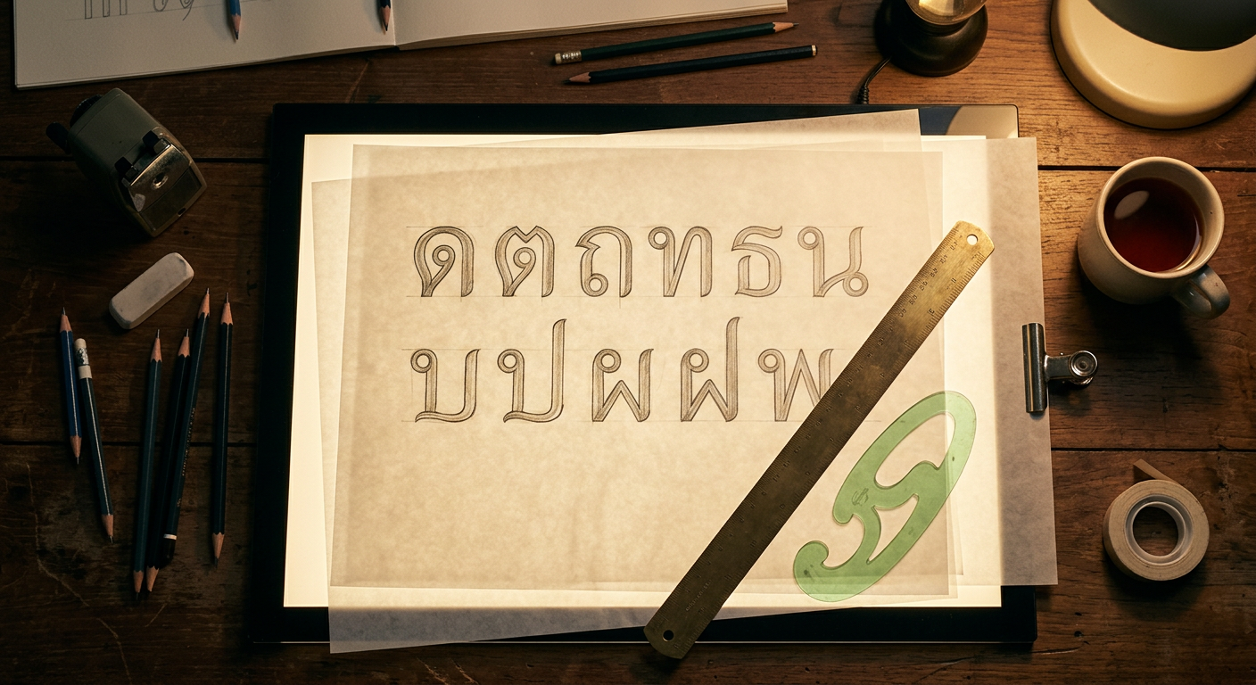
Step 2: Draw ก (ko kai) — the master consonant
ก contains every structural element in Thai consonants: a loop at the top-left, a vertical stem, and a horizontal base with an exit curl. Start with the loop. Using the Ellipse tool, draw a 90 × 90 mm circle at the top-left of the consonant body zone, top edge at 540 mm. Adjust with Direct Selection (A) to tighten the loop to 88 mm wide × 85 mm tall (loops are slightly wider than tall in looped Thai). The loop opens downward-right. Draw the stem: a vertical path from loop bottom to baseline (180 mm), with a 32 mm consistent stroke width. At the baseline, draw a horizontal path extending 180 mm rightward. Add the exit curl: a quarter-circle curl at the right end of the horizontal path, curving up then stopping. Outline stroke (Object > Path > Outline Stroke) to convert to filled shapes. Pathfinder > Unite.
Step 3: Draw ข (kho khai) — loop plus angled stem
ข shares ก’s loop but adds an angled stem instead of vertical. Copy the loop from ก (Cmd/Ctrl+C > Cmd/Ctrl+F) and place at the top-left of a new consonant slot. Draw the stem as a diagonal line from loop bottom to the baseline center, slight rightward lean at 8°. From the baseline, draw a horizontal base path rightward 170 mm. Add the distinguishing ข feature: a small hook at the top-right of the loop, curving outward. This hook is ก vs ข: a single 20 mm curl pointing right. Outline and Unite.
Step 4: Draw ค (kho khwai) — loopless variant for comparison
ค in its modern loopless form has no loop at all — the top-left simply terminates in a small open curl. Draw the stem as vertical from 540 mm to baseline, stroke width 32 mm. At the top, draw a 30 mm diagonal curl going up-and-right, terminating in an open pointed tip. This is the loopless construction that IBM Plex Thai and Noto Sans Thai Looples use (see /fonts/ibm-plex-thai/). Horizontal base identical to ก. Contrast visually with your ก — the loopless head is what the loopless revolution is about.
Step 5: Draw ง (ngo ngu) — the wave consonant
ง has no loop; its signature is the wave curve at the top. Draw a single path that starts at the baseline left, rises vertically to 540 mm, curves right across 120 mm forming an S-wave, descends back to the baseline. The wave must be continuous — no corner anchors. Use the Pen tool with long handle extensions. Stroke width stays 32 mm. Outline and Unite. ง is the clearest test of a designer’s curve discipline; its wave must flow without kinks.
Step 6: Draw จ (cho chan) — loop with right stem
จ mirrors ก’s logic but with the stem on the right. The loop sits at the top-right, opening downward-left. The stem descends from the loop to the baseline on the right side. The horizontal base extends leftward from the stem bottom. Mirror the ก construction horizontally as a starting point (Object > Transform > Reflect > Vertical) then adjust the loop — จ’s loop is slightly smaller (80 × 78 mm) and opens at a steeper angle. This is a subtle but critical difference; mistaking ก for จ changes the word.
Step 7: Compare, align, export for type production
Place all five consonants in a single horizontal row at the same baseline. Check optical alignment: Thai consonants with loops should sit slightly lower than loopless forms so the loop top aligns with the cap-line rather than exceeding it. Adjust stem weights to match optically — the eye reads ง’s wave as slightly heavier than ก’s vertical stem, so ง’s stroke needs 1-2 mm of reduction. Select all five consonants, Object > Path > Outline Stroke if not already outlined, Pathfinder > Unite per consonant group. File > Export > Export As > SVG for each — SVG is the standard import format for Glyphs and FontLab. Name files uni0E01.svg (ก), uni0E02.svg (ข), uni0E04.svg (ค), uni0E07.svg (ง), uni0E08.svg (จ) using the Unicode hex codes for the Thai block.
Cultural considerations
Thai type design has a strong tradition of stroke-order logic: designs that ignore the calligrapher’s hand movement read as structurally wrong even when their proportions are correct. Three hand-logic principles apply. First, loops are always drawn in a single clockwise motion starting from the loop’s attachment point to the stem — so a loop’s opening direction is always consistent with that motion, and designs with reversed openings read as backwards. Second, vertical stems are drawn top-to-bottom, so their weight tapers subtly thicker at the bottom in humanist designs and stays constant in geometric designs — but a thicker-at-top stem is always wrong. Third, horizontal bases are drawn left-to-right in every consonant; a horizontal base that visually suggests right-to-left motion is a structural error. These are not aesthetic preferences; they are inherited from 700 years of scribal convention (Winitchaikul, 2018).
Common mistakes
- Inconsistent stroke weights across the alphabet. Thai consonants must optically match — a 32 mm stem on ก and a 28 mm stem on จ reads as two different fonts.
- Reversed loop openings. Breaks the calligraphic hand logic.
- Missing exit curls. ก’s baseline exit curl is not decorative; it is a structural feature.
- Starting with vowels. Vowels are drawn after the consonant body zone is locked. Designing them in parallel causes proportion drift.
- Copying specimens instead of constructing. Professional Thai type design always starts from principles; tracing is learning by rote and produces derivative forms.
Source files and next steps
The 700-unit em-square grid is available at /fonts/categories/loopless/ along with reference construction sheets for all 44 consonants. For context on the loopless movement that shaped contemporary Thai type design, read The Loopless Revolution: Modern Thai Type and the pillar Complete Guide to Thai Typography. Full font directory with construction reference fonts: /fonts/. The next step in the type-design workflow — converting Illustrator SVGs into a working .otf — is covered in a separate Glyphs app tutorial (coming soon).
Information verified as of April 2026
Sources
- The Thai consonant ก (ko kai) is the canonical starting point for Thai typeface design because its construction contains every primary stroke logic of the script: loop, vertical stem, and horizontal base.—Chaiwong, A. (2019). Designing Thai Type: A Practical Manual. Cadson Demak Publishing. (accessed Apr 5, 2026)
- Cadson Demak's design methodology specifies a 700-unit em-square with a 500-unit x-height equivalent for loopless Thai, giving a 71% proportion that matches Latin humanist type.—Cadson Demak — Type Design Methodology, Typotheque Journal, 2022 (accessed Apr 2, 2026)
- Thai consonants occupy a body zone equivalent to Latin cap-height, with vowels and tone marks extending above and below; a functional Thai typeface design must first lock this body-zone before adding vowel glyphs.—Winitchaikul, P. (2018). Thai Letterform Construction. Silpakorn University Press. (accessed Apr 4, 2026)
- Illustrator's Glyphs panel and variable-width stroke profiles are the core Thai type-design tooling before export to FontLab or Glyphs app for hinting and OpenType production.—Adobe — Working with glyphs, Illustrator User Guide (2024 revision) (accessed Apr 6, 2026)