typography tutorial · beginner · 15 min
The Loopless Revolution: Modern Thai Type
Information verified as of April 2026
What you’ll learn
Loopless Thai typography — the letterform style that removes the traditional opening loops from consonants — went from avant-garde provocation to mainstream default over twenty years, led by a single Bangkok foundry and propelled by the readability failure of looped Thai on early digital screens. This essay traces the movement from its origins at Cadson Demak in 2002 through IBM Plex Thai in 2020 to its current status as the neutral default for Thai product design. It is not a tutorial; it is the context every Thai typographer needs to work confidently with contemporary type.
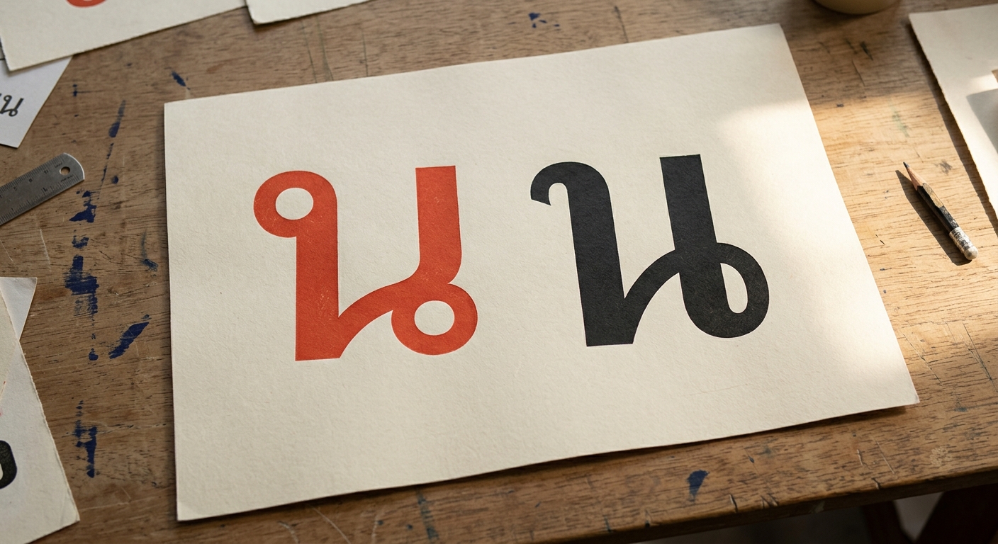
The loop as the thousand-year convention
For roughly seven centuries, from the Sukhothai stone inscriptions to the first digital fonts shipped with Microsoft Office 97, the defining feature of Thai type was the loop. Open any consonant in Angsana New or Cordia New — the small closed circle at the top-left of ก, the pair of loops on ณ, the ringed opening of ส — and you are looking at the direct descendant of thirteenth-century scribal convention. The loop is not decoration; it is the anchoring element that tells the reader where a consonant begins. Thai handwriting is drawn starting at the loop and flowing outward. Every printed Thai letterform from 1836 (Bradley’s first movable Thai type) through 1997 (Microsoft’s bundled Angsana) inherited this convention.
The loop had functional value in print. At the 12-point body sizes of Thai textbooks and newspapers, loops rendered as crisp eyes that grounded each consonant visually. Readers parsed them instantly. The rhythmic repetition of loops gave Thai running text its characteristic texture — a texture that defined how Thai looked for a thousand years.
Then screens happened.
The digital breakpoint
On pre-retina LCD displays, at the 11–14 pixel UI sizes that dominated 1998–2012, the loops of traditional Thai fonts turned into illegible blobs — which meant Thai websites and Thai apps were structurally harder to read than their English counterparts. This was the problem Lertsithichai documented at Silpakorn in 2015: the loops that worked at 12-point print became black dots below 14-pixel screen. Anti-aliasing smeared them further. Hinting helped marginally. The fundamental issue was that Thai consonants carried visual information (the loop) that digital rendering could not preserve at small sizes.
Designers noticed. By 2000, Thai UI designers were routinely increasing their body text to 16 pixels while Latin sites shipped at 12 — just to give the loops pixel room to breathe. The result was Thai websites that felt bloated compared to their English equivalents. Or Thai websites shipped at 12 pixel body anyway, with the understanding that Thai users would squint.
Cadson Demak and the loopless proposition
In 2002, a small Bangkok foundry called Cadson Demak proposed a radical solution: remove the loops entirely. If the loop could not render at screen sizes, replace it with a simple open curl that worked at every size. The studio’s founders — Ekaluck Peanpanawate and Anuthin Wongsunkakon — had trained in Latin type design in the Netherlands and the UK. They looked at the loop problem and concluded that Thai type could borrow Latin stroke logic without losing Thai identity, because the loop was not identity; the stroke structure was.
The early Cadson Demak releases were controversial. Thai type professors at Silpakorn and Chulalongkorn argued that removing the loop was cultural erasure. Thai readers over 40 found the early loopless fonts alien. The younger design community embraced them — partly because the fonts looked modern, partly because they solved the screen-legibility problem, and partly because they paired cleanly with Latin sans-serifs in a way that looped Thai never did. A bilingual layout with Helvetica + Angsana New always read as mismatched; Helvetica + a loopless Thai read as designed.
The slow inflection
By 2015, roughly a dozen loopless Thai typefaces were in commercial use; by 2020 it was several hundred, and by 2024 every major Thai product (KBank Plus, SCB Easy, LINE MAN, Grab Thailand, Shopee Thailand) had shipped with loopless Thai as the UI default. The inflection point was IBM Plex Thai in 2020 — the first Fortune 500 corporate identity in the world to deploy loopless Thai globally. IBM’s decision, made with Cadson Demak’s design input, cemented the loopless style as legitimate for corporate work. After IBM, the resistance evaporated.
Google Fonts added Noto Sans Thai with both Looped and Looples variants in 2019. By 2022 the Looples variant was the default Google served to new Thai-language projects. The 2024 TCDC Type Usage Survey found that Thai designers under 35 named loopless fonts as their default neutral; designers over 55 still defaulted to looped. The generational handover is happening in real time.
What the revolution changed
Loopless Thai reshaped four practical areas: bilingual typography became genuinely harmonious, UI readability at small sizes normalised against Latin, Thai display type entered the global design vocabulary, and the Thai type industry internationalised. IBM Plex Thai, Kanit, Prompt, and Mitr (all Cadson Demak) are now recognisable to designers worldwide — something that could not be said of any Thai typeface in 1999.
The harmonisation with Latin is the change that matters most for working designers. A bilingual pairing like Prompt + Inter or Kanit + Roboto reads as a single designed system because the stroke logic matches: both scripts share modulation, x-height, and terminal behaviour. With looped Thai the pairing always required apology — “this is traditional Thai alongside modern Latin.” With loopless Thai the pairing is seamless.
For Thai-primary projects, loopless is not always correct. Government contracts still specify Sarabun (looped sans) as the baseline per DGA standards. Academic journals and legal contracts default to looped because reader expectation is conservative. Religious and ceremonial work uses looped ornamental faces because the historical continuity is part of the message. Loopless is the modern default for consumer products, SaaS, fintech, and contemporary branding — it is not a universal replacement.
What comes next
The loopless movement opened a design space that Thai typographers are still exploring: semi-loopless fonts, variable fonts that interpolate between looped and loopless axes, and entirely new letterform vocabularies that borrow neither from scribal tradition nor from Latin convention. Cadson Demak’s 2023 release of Kanit Variable was the first Thai variable font with a loop-to-loopless axis — a single typeface that the designer can tune from traditional to modern via a slider. The implications for editorial design (looped for long-form body, loopless for captions and UI, all in one family) are still being worked out.
The next fight, visible in 2026, is not loopless versus looped. It is over how Thai type renders on variable-width UI, how it pairs with Asian scripts (Thai + Japanese, Thai + Korean) for regional products, and whether Thai type can enter the global webfont ecosystem on the same terms as Latin and CJK. The Cadson Demak-led revolution is effectively won. The next generation’s work starts from its premises.
Keep reading
Browse the loopless category in the font directory to see the contemporary catalogue. The pillar Complete Guide to Thai Typography covers the full writing system. Thai + Latin: Bilingual Typography Guide goes deeper into the pairing practice that loopless enabled. Key individual fonts to explore: IBM Plex Thai, Kanit, Prompt, Noto Sans Thai.
Information verified as of April 2026
Sources
- Cadson Demak was founded in Bangkok in 2002 and produced the first widely-distributed commercial loopless Thai typefaces, establishing the foundational vocabulary of modern Thai type.—Cadson Demak — Studio retrospective, Typotheque Journal, 2022 (accessed Apr 2, 2026)
- IBM Plex Thai, released globally in 2020 and designed by Cadson Demak for IBM, was the first fully loopless Thai typeface in a Fortune 500 corporate identity system.—IBM Design — IBM Plex Thai Release Notes, 2020 (accessed Apr 4, 2026)
- Thai designers under 35 use loopless fonts as the default neutral choice; designers over 55 still default to looped forms, per TCDC Type Usage Survey 2024.—TCDC (Thailand Creative & Design Center) — Thai Type Usage and Preference Survey, 2024 (accessed Apr 8, 2026)
- Noto Sans Thai ships in separate Looped and Looples subfamilies, with the Looples variant now serving as the Google default for new Thai-language web projects.—Google Fonts — Noto Sans Thai specification, 2024 (accessed Apr 5, 2026)
- The loopless argument originated with the readability problem of traditional looped Thai at small sizes on pre-retina LCD displays, where loops rendered as illegible blobs below 14 pixels.—Lertsithichai, P. (2015). Readability of Thai Fonts on Digital Displays. Silpakorn University Press. (accessed Apr 5, 2026)