Thai font · OFL
Fahkwang
ฟ้ากว้าง
Information verified as of April 2026
What Fahkwang is
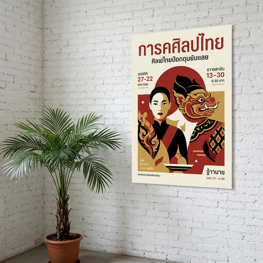
Fahkwang is a humanist display Thai sans-serif from Cadson Demak with a soft, open character — the name (ฟ้ากว้าง) translates loosely as “wide sky” and the design follows through with spacious, airy letterforms. It ships six weights with matching italics under the SIL Open Font License.
The design sits in the same family of humanist loopless Thai sans as Bai Jamjuree and Mitr, but pushes the proportions wider and the terminals softer. At display sizes, Fahkwang feels almost editorial — the wider counters and rounded terminals carry a magazine-quality warmth that narrower display faces like Athiti cannot match.
The font is used widely in Thai editorial, lifestyle publishing, and mid-premium consumer brands that want “modern with warmth” as their typographic tone.
Character design and tone
Fahkwang uses wide proportions, soft curved terminals, and open loopless consonant heads that together produce an airy, editorial tone at display sizes. The head of ก is an open curve with a subtle inward roll; ถ, ภ, and ร have generously wide bowls.
Stroke modulation is subtle — more than Kanit, less than a serif. Where Bai Jamjuree leans into pen-drawn contrast, Fahkwang keeps the modulation minimal and lets the width and softness carry the character. At Bold weight, the rounded terminals become more prominent and the font gains a confident, grounded display presence.
Italic cuts rotate at a gentle angle and preserve the same rounded terminals. The Latin companion is a humanist sans with slightly flared stems — reminiscent of Mr Eaves or Museo Sans, with lower contrast than both. Numerals are lining and align to cap height.
Weights and availability
Fahkwang ships six weights from ExtraLight (200) to Bold (700) with matching italics across the full range. Download from Google Fonts or the Cadson Demak catalogue.
File sizes are around 45-60KB per weight in WOFF2. A production loadout typically uses Light for display headlines and Medium for mid-size editorial subheadings; the italics earn their place in magazine-style pull quotes and captions.
Best use cases
Fahkwang is a reliable default for editorial and lifestyle brands that want warmth and openness in their display type. Strong briefs:
- Lifestyle and travel magazine design — covers, features, section dividers
- Wellness, yoga, and retreat branding where openness reads as calm
- Interior design and homeware branding — catalogues, lookbooks, collateral
- Editorial blog design for long-form Thai content with a magazine aesthetic
- Co-working space, boutique gym, and studio branding
Where it doesn’t fit: corporate fintech and enterprise UI (too warm, use IBM Plex Thai), government documents, and heavy UI work where narrower faces save horizontal space.
Pairings
Fahkwang pairs with transitional serifs and humanist sans that share its editorial warmth. Three pairings:
- Lora — transitional Latin serif for body copy under Fahkwang display
- Source Serif Pro — editorial Latin serif for longer-form reading under Fahkwang titles
- Sarabun — neutral looped Thai for long-form Thai body when Fahkwang carries display
Licensing
Fahkwang is released under the SIL Open Font License and can be used commercially, modified, and bundled in products provided the OFL notice travels with the file. Verify at the Google Fonts specimen or the Cadson Demak catalogue. All weights and italics are included in the free licence.
Information verified as of April 2026
Sources
- Fahkwang was designed by Cadson Demak and is distributed on Google Fonts under the SIL Open Font License.—Google Fonts specimen page for Fahkwang (accessed Apr 10, 2026)
- Fahkwang ships seven weights with matching italics, covering Thai and Latin scripts.—Cadson Demak catalogue entry for Fahkwang (accessed Apr 10, 2026)