Thai font · OFL
Athiti
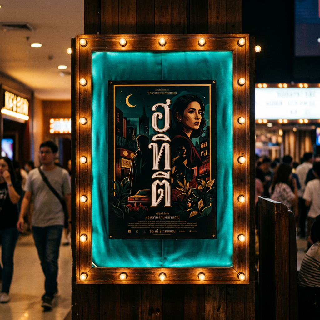
อติถิ
Information verified as of April 2026
What Athiti is
Athiti is a display-oriented loopless Thai sans-serif from Cadson Demak, drawn with a tall silhouette and narrower proportions than Kanit or Prompt so it reads best at larger sizes. It ships six weights under the SIL Open Font License on Google Fonts.
The name Athiti (อติถิ) means “guest” in Thai — a hint at the font’s intended use in hospitality-adjacent brands. The proportions favour headline and poster work: tall consonants, compressed counters, and a slightly condensed overall width compared to Cadson Demak’s body-copy sans.
In the open catalogue of free Thai fonts, Athiti occupies a specific niche: a modern display Thai sans that still functions at medium sizes. Not a body font, not a novelty display — a workable mid-display that carries editorial weight.
Character design and tone
Athiti uses tall stems, narrow counters, and open loopless terminals to produce a silhouette that feels elegant and urban rather than chunky or geometric. The head of ก is a small tight hook; ถ and ภ have narrow but open bowls.
Stroke weight is mostly monolinear, but at heavier weights the contrast between verticals and curves picks up, which keeps the display cuts from going muddy. Thai tone marks are drawn proportionally taller than on body-copy sans, matching the stretched silhouette. Vowel signs like สระอี and สระอา sit at optically consistent heights across the weight range.
The Latin companion is a narrow humanist sans in the Oswald / Barlow Condensed neighbourhood — same tall proportions, cleanly drawn. Capital letters read slightly condensed compared to Kanit or Prompt, which helps the bilingual pair feel cohesive at display sizes.
Weights and availability
Athiti ships six weights from ExtraLight (200) to Bold (700) in upright-only cuts. Italic cuts are not part of the current release. Download from Google Fonts or the Cadson Demak catalogue.
File sizes are around 40-55KB per weight in WOFF2. Because Athiti is narrower than most Cadson Demak fonts, you can fit more headline text per line, which makes it useful for hero copy where horizontal space is tight.
Best use cases
Athiti is built for display and mid-size editorial use where narrow proportions help the layout breathe. Strong briefs:
- Boutique hotel and resort branding (signage, wayfinding, room collateral)
- Fashion and lifestyle magazine headlines with Thai-English bilingual flow
- Event branding — film festivals, design weeks, cultural programmes
- Real estate and property developer headline typography for condo marketing
- Premium F&B menu headers where a condensed display sans carries more weight than a wider face
Where it doesn’t fit: long-form body text (counters are too narrow, reach for Sarabun or Mitr), government documents, and UI at small sizes.
Pairings
Athiti pairs best with wider, open Latin sans that contrast against its narrow proportions, or with serif companions for editorial layouts. Three pairings:
- Oswald — narrow Latin sans with matching proportions, strong Thai-English headline pair
- Source Sans 3 — wider humanist Latin for body text under Athiti display
- Lora — serif body copy under Athiti headlines for editorial magazines
Licensing
Athiti is released under the SIL Open Font License with all weights free for commercial use, modification and bundling provided the OFL notice travels with the font. Verify at the Google Fonts page or the Cadson Demak specimen. No paid licence is required.
Information verified as of April 2026
Sources
- Athiti was designed by Cadson Demak and distributed on Google Fonts under the SIL Open Font License.—Google Fonts specimen page for Athiti (accessed Apr 10, 2026)
- Athiti ships in five weights and is designed primarily as a display Thai sans-serif.—Cadson Demak catalogue entry for Athiti (accessed Apr 10, 2026)