Thai font · OFL
Bai Jamjuree
ใบจามจุรี
Information verified as of April 2026
What Bai Jamjuree is
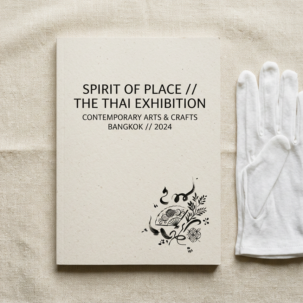
Bai Jamjuree is a display-oriented humanist Thai sans-serif from Cadson Demak, named for the Jamjuree tree (ต้นจามจุรี) whose organic silhouette inspired the font’s soft, flowing curves. It ships six weights with matching italics under the SIL Open Font License on Google Fonts.
The design sits between a display face and a mid-size editorial face. The letterforms are distinct enough to carry poster and headline work, but disciplined enough to hold at 14-18pt for subheadings and short paragraphs. That range makes Bai Jamjuree unusually versatile in the Cadson Demak catalogue.
The font is a fixture in Thai creative-sector branding — design studios, art festivals, craft and artisan brands — because it balances modernity (loopless construction) with a tactile, hand-drawn tone that geometric faces like Kanit deliberately avoid.
Character design and tone
Bai Jamjuree uses flowing organic curves, subtle stroke modulation, and open loopless terminals that feel pen-drawn rather than computer-constructed. The head of ก curves softly inward; ถ and ภ have wide, open bowls with gentle terminal flares.
Stroke contrast is moderate — noticeably more than Kanit or Prompt but less than a classical serif. The pen-like modulation is most visible at heavier weights, where verticals thicken while the connecting strokes stay lighter. Tone marks and vowel signs carry the same organic feel, drawn with slight curves rather than straight strokes.
Italic cuts rotate at a modest angle (around 8-10°) and keep the same organic letter construction rather than switching to a true italic skeleton. The Latin companion is a humanist sans with the same soft modulation — reminiscent of Trirong’s Latin or a softened Lato.
Weights and availability
Bai Jamjuree ships six weights from ExtraLight (200) to Bold (700) with matching italics across the full range — a relatively rare feature in free Thai fonts. Download from Google Fonts or the Cadson Demak catalogue.
File sizes run around 45-60KB per weight in WOFF2. For production, a four-file loadout (Regular, Regular Italic, SemiBold, SemiBold Italic) handles editorial layouts at about 200KB total.
Best use cases
Bai Jamjuree is a strong default for creative-industry brands that want a modern Thai sans with warmth and tactility. Strong briefs:
- Design studio and creative agency branding, Thai and bilingual
- Art festivals, exhibition catalogues, museum publication design
- Craft and artisan product branding — ceramics, textiles, natural skincare
- Independent publishing — literary magazines, poetry books, small-press work
- Cafe and restaurant brands that want “designed” without being corporate
Where it doesn’t fit: enterprise and fintech UI (too warm, use IBM Plex Thai), long-form body text (Sarabun, Mitr, or Niramit are more neutral), and government documents.
Pairings
Bai Jamjuree pairs well with humanist Latin sans-serifs, transitional serifs, and editorial body typefaces. Three pairings:
- Lato — humanist Latin sans with matching warmth and modulation
- Lora — transitional serif for editorial body copy under Bai Jamjuree display
- Noto Serif Thai — if the body needs to stay Thai, the looped serif contrasts well against Bai Jamjuree’s loopless display
See the fonts directory for more editorial pairing options.
Licensing
Bai Jamjuree is released under the SIL Open Font License and is free for commercial use, modification, and bundling in products provided the OFL notice travels with the file. Verify at the Google Fonts specimen or the Cadson Demak page.
Information verified as of April 2026
Sources
- Bai Jamjuree was designed by Cadson Demak and distributed through Google Fonts under the SIL Open Font License.—Google Fonts specimen page for Bai Jamjuree (accessed Apr 10, 2026)
- Bai Jamjuree ships six weights with matching italics covering Thai and Latin.—Cadson Demak catalogue entry for Bai Jamjuree (accessed Apr 10, 2026)