Thaitone · pink
Lotus Pink
ชมพู
(chomphu)
Information verified as of April 2026
- HEX
#E86CA0- RGB
232, 108, 160- CMYK
0, 53, 31, 9- HSL
335°, 73%, 67%- Tailwind
bg-[#e86ca0]- Thaitone index
- #12
What Lotus Pink is
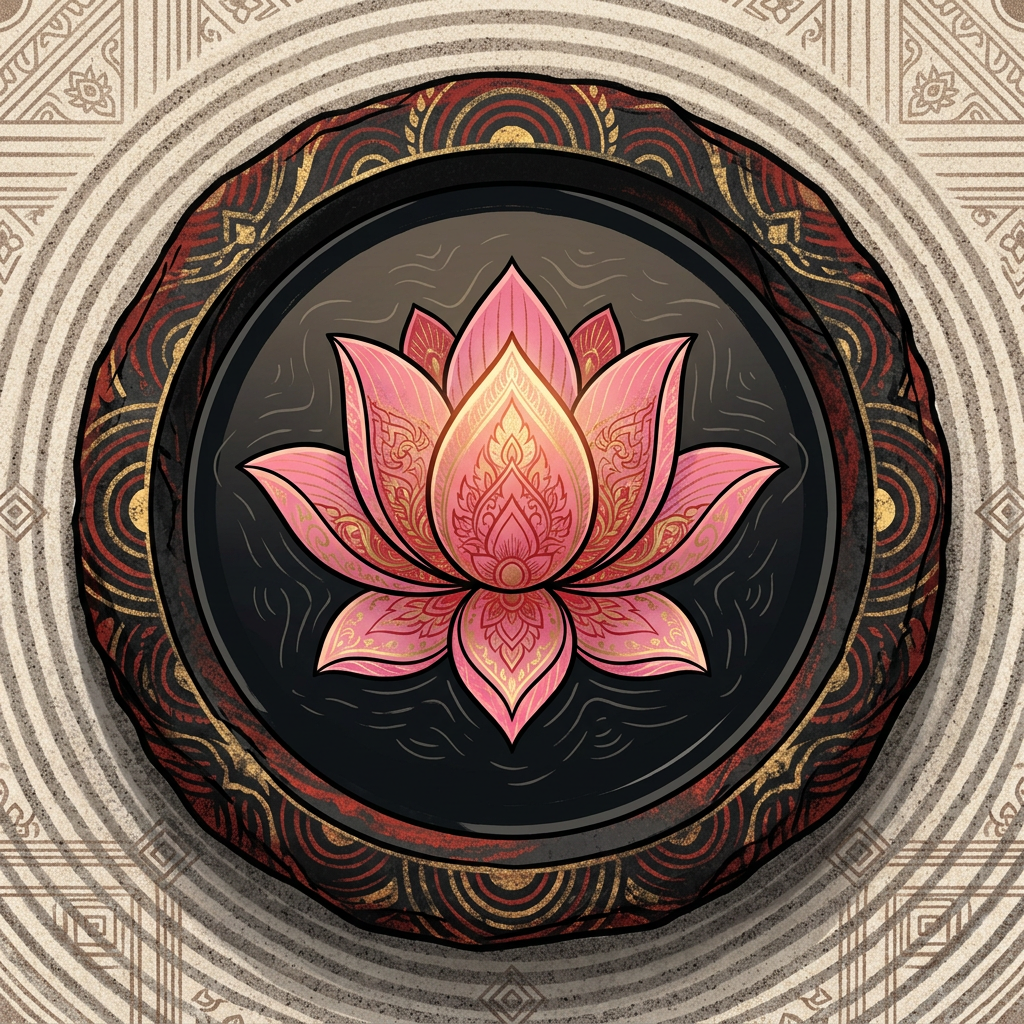
Thai Lotus Pink (ชมพู, chomphu) is the festival and Tuesday-weekday pink of Loy Krathong and Thai celebration — a bright, slightly warm pink at #e86ca0 that reads as cheerful and celebratory rather than sweet. The word chomphu covers pink in Thai generally and references the pink lotus (Nelumbo nucifera), the flower form most associated with Buddhist offering.
Pittayamatee’s Thaitone entry places the color at the crossover of festival and everyday categories. It is more saturated than pastel pink and carries slightly more blue than Western “hot pink,” which keeps it in the celebratory rather than commercial register.
Where this color traditionally appears
The canonical reference is the pink lotus offered at temples and the pink silk blouses worn on Tuesdays in the si prajam wan system. Pink lotus also dominates Loy Krathong imagery and the floating krathong baskets themselves in contemporary festival design.
The color appears on Thai festival garlands at weddings and Songkran, on the pink taxis of Bangkok (a direct continuation of the weekday color system applied to public vehicles), on Pink Lady and other Thai fruit branding, and on the Royal Rail Pink Line metro brand identity in Bangkok. Pink Chulalongkorn Hospital publications also use it in institutional contexts.
What it means in Thai culture
Lotus Pink signals festival, Tuesday, and celebration — a joyful color with light royal-institutional weight. The Royal Institute Dictionary documents pink as Tuesday’s weekday color, historically tied to King Chulalongkorn’s recovery from illness.
The color carries minor religious association through pink lotus offering but is not restricted. It is considered safe and friendly for most commercial use, and it sits close enough to international pink conventions that it translates to export markets without cultural mismatch. The pink taxi and pink hospital associations also give it a soft civic reading.
Using Lotus Pink in modern design
Lotus Pink works best for festival branding, children’s and family products, and Thai cosmetics and fashion. Three concrete briefs:
- Festival and event identity — Loy Krathong, Songkran variants, wedding markets; pink as 60–70% dominant color with rice paper or cream accents.
- Family FMCG and Thai dessert brands — pink packaging for coconut-based desserts, Thai snacks, and fruit candy; reads as celebratory and Thai-native.
- Cosmetics and fashion for the Thai and ASEAN market — pink label systems with lacquer black typography; stays sophisticated rather than childish.
It fails for serious tech, finance, and state-institutional work where the register reads too celebratory.
Complementary colors
Three pairings carry Lotus Pink cleanly. With Rice Paper, the combination reads as soft Thai editorial — suitable for wedding, dessert, and cosmetics publishing. With Royal Teal, the contrast is the canonical bencharong porcelain palette that used pink and green together on royal tableware. With Lacquer Black, the pink sharpens into contemporary Thai streetwear and beauty packaging where the contrast keeps the color adult.
Browse the full Thaitone system or open the color picker to build a palette.
Information verified as of April 2026
Sources
- Documented in the Thaitone system as one of 168 traditional Thai colors.—Pittayamatee, P. (1988). Thai Colour. Amarin Printing, Bangkok. (accessed Apr 10, 2026)
- Pink is one of two recognized Thai weekday colors for Tuesday, historically associated with King Chulalongkorn (Rama V), who was reported recovered from illness on a Tuesday.—Royal Institute Dictionary, Office of the Royal Society, Bangkok (revised edition 2011) (accessed Apr 10, 2026)