Thaitone · white
Rice Paper
กระดาษสา
(kradat sa)
Information verified as of April 2026
- HEX
#FBF8F1- RGB
251, 248, 241- CMYK
0, 1, 4, 2- HSL
42°, 56%, 96%- Tailwind
bg-[#fbf8f1]- Thaitone index
- #14
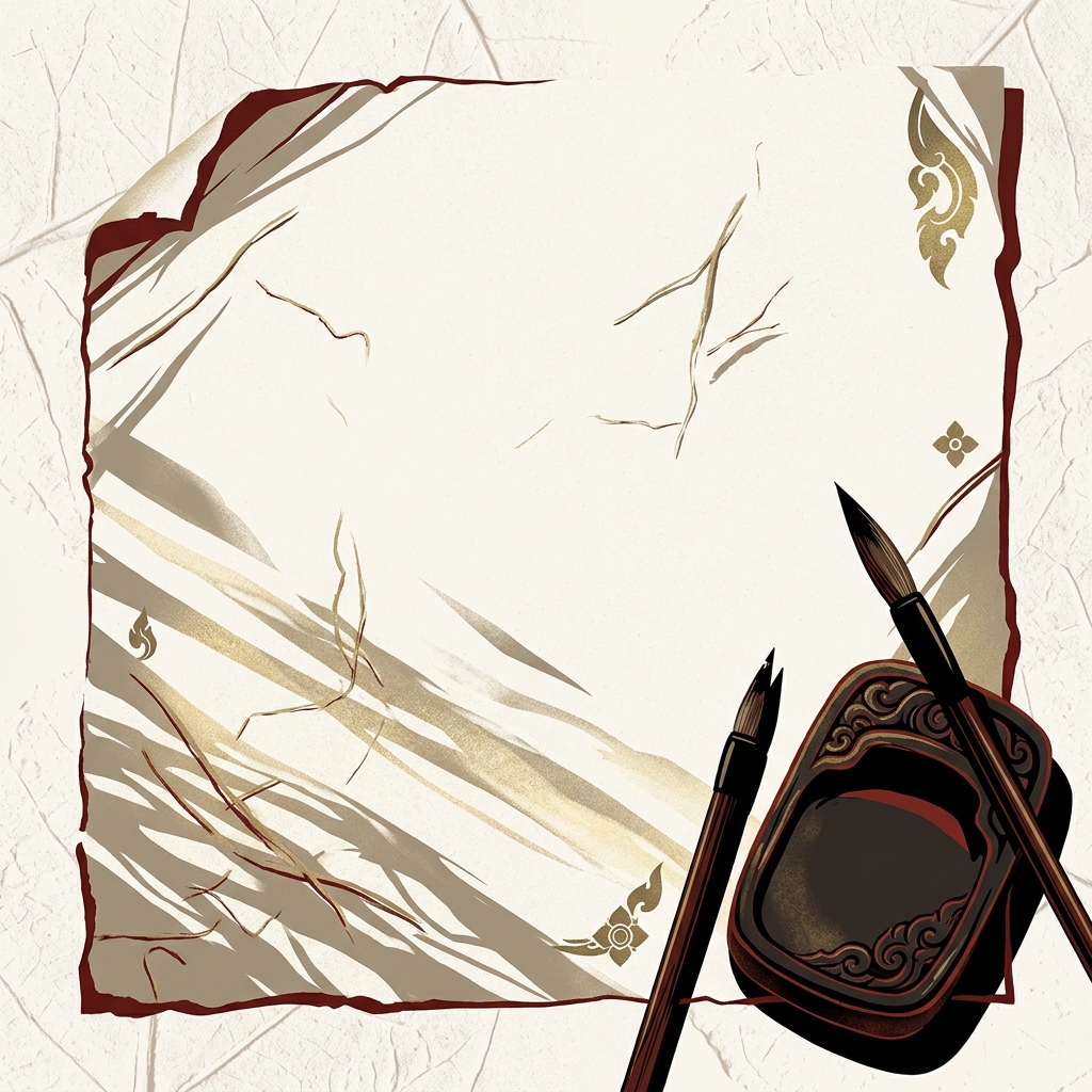
What Rice Paper is
Thai Rice Paper (กระดาษสา, kradat sa) is the soft warm cream of traditional handmade sa paper and Thai manuscript pages — a low-saturation, slightly yellow-biased off-white at #fbf8f1 that reads as natural and warm rather than clinical. The substrate is paper mulberry (Broussonetia papyrifera) bark pulp rather than true rice — the English name is a misnomer.
Pittayamatee’s Thaitone entry places the color within the everyday craft (wisai) register. It sits warmer than printing-paper white and lighter than Jasmine, occupying a specific slot in the Thai neutral register as craft-cream. On screen it reads as very light ivory.
Where this color traditionally appears
The canonical reference is the handmade sa paper used for palm-leaf manuscripts and Thai traditional umbrellas in Bor Sang village, Chiang Mai. The color describes the base substrate of northern Thai manuscript, umbrella, and lantern production.
The color also appears on the unglazed portion of Sangkhalok ceramic, on raw silk before dyeing, on Thai wedding invitations and temple merit-ceremony cards, and as the default stock for premium Thai editorial publishing. Bor Sang umbrellas are often left in the natural sa-paper color before painting decoration.
What it means in Thai culture
Rice Paper signals craft, calm, and traditional manuscript material — a neutral register appropriate for almost all Thai cultural contexts. The Royal Institute Dictionary documents kradat sa specifically as the handmade paper, distinct from kradat khao (white paper) which refers to machine-made stock.
The color carries no weekday or religious restriction. It is considered the default “Thai neutral” — where Western design defaults to pure white, Thai heritage design defaults to rice paper. It is appropriate for all categories and pairs with essentially every other Thaitone color.
Using Rice Paper in modern design
Rice Paper works as the default neutral across Thai heritage design — hospitality, publishing, packaging, wellness. Three concrete briefs:
- Thai editorial and cultural publishing — rice paper ground across books, magazines, catalogues; warmer and more readable than pure white on uncoated stock.
- Premium Thai hospitality identity — rice paper as brand background with single accent color; used by Aman, Rosewood, and Capella Thai properties.
- Heritage food and wellness packaging — rice paper substrate with hand-rendered type; reads as natural, crafted, and Thai.
It fails only in contexts that require high-contrast brightness — sports brands, tech aimed at energy register, and any category where “pure white” is a specific signal.
Complementary colors
Three pairings carry Rice Paper cleanly. With Lacquer Black, the combination is the default Thai editorial palette — the highest-register neutral pair in the Thaitone system. With Thai Vermilion, the pairing is canonical festive Thai — cream ground with vermilion accent type for publishing and packaging. With Indigo, the combination is the standard craft-textile register, directly evoking indigo thread on handwoven cotton.
Browse the full Thaitone system or open the color picker to build a palette.
Information verified as of April 2026
Sources
- Documented in the Thaitone system as one of 168 traditional Thai colors.—Pittayamatee, P. (1988). Thai Colour. Amarin Printing, Bangkok. (accessed Apr 10, 2026)
- Sa paper (kradat sa) is handmade in northern Thailand from the inner bark of the paper mulberry tree (Broussonetia papyrifera), producing a warm cream substrate used for manuscripts, umbrellas, and contemporary design work.—Fine Arts Department, Ministry of Culture — Traditional Thai Paper Craft Atlas, 2016 (accessed Apr 10, 2026)