Thaitone · pink
Silk Rose
ชมพูไหม
(chomphu mai)
Information verified as of April 2026
- HEX
#DFB5A0- RGB
223, 181, 160- CMYK
0, 19, 28, 13- HSL
20°, 50%, 75%- Tailwind
bg-[#dfb5a0]- Thaitone index
- #19
What Silk Rose is
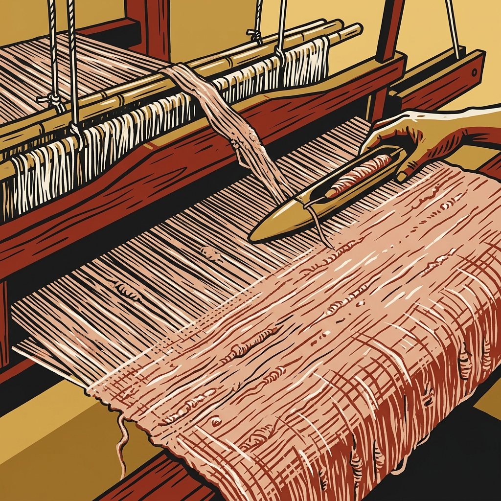
Thai Silk Rose (ชมพูไหม, chomphu mai) is the soft dusty pink of natural-dye Thai silk — a low-saturation, warm peachy-pink at #dfb5a0 that represents sappanwood decoction on raw silk. The color sits in the muted register of heritage Thai textile dyes rather than the bright festival pink of Lotus Pink.
Pittayamatee’s Thaitone entry documents this as a craft-silk color category. Sappanwood (fang) produces shades from soft peach through rose and deeper red depending on mordant. This particular tone is the alum-mordant short-dip result common in Surin and Chiang Mai silk villages.
Where this color traditionally appears
The canonical reference is mat mi silk weft thread from Surin and Buriram weaving villages, and the dusty-pink register of pha yok brocade at lower saturation. The color shows on contemporary Queen Sirikit Institute silk specifications.
It appears on Thai ceremonial napkins and table linens at royal dinners, on lining silk in Chakri-era court jackets, on hand-woven cotton at lower saturation in Sakon Nakhon village production, and on the embroidered flower motifs of pha chok decorative strip borders. The Jim Thompson Thai Silk brand uses silk rose as a signature seasonal color across product lines.
What it means in Thai culture
Silk Rose signals natural-dye craft, soft femininity, and heritage silk quality — a quiet, premium register without royal or religious restriction. The Royal Institute Dictionary documents chomphu as the base color term with mai adding the silk-specific reading.
The color is considered safe across commercial use and is particularly strong for wellness, cosmetics, and fashion aimed at the Thai and regional female market. It is adjacent enough to the Jim Thompson commercial palette to read as sophisticated Thai heritage and far enough from Lotus Pink to avoid festival or children’s category confusion.
Using Silk Rose in modern design
Thai Silk Rose works best for silk and fashion retail, cosmetics, and boutique hospitality aiming at feminine sophistication. Three concrete briefs:
- Thai silk brand identity and lookbook design — silk rose as 30–50% accent with cream and teak; reads as natural-dye premium silk to both Thai and export markets.
- Cosmetics and beauty packaging for the ASEAN market — full-field rose with black typography; sits sophisticated and Thai-coded simultaneously.
- Spa, retreat, and wellness identity — silk rose with rice paper and celadon; calm, feminine register without becoming generic spa-beige.
It fails for technology, sports, and any category where a brighter or more saturated color is expected.
Complementary colors
Three pairings carry Silk Rose cleanly. With Rice Paper, the combination is the default craft-silk publishing palette — rose accent on cream editorial ground. With Indigo, the contrast evokes indigo-and-rose natural-dye textile pairings used across contemporary Thai slow-fashion labels. With Teak, the pairing reads as Lanna craft interior — silk cushion on teak wood — suitable for boutique hotels and heritage homeware.
Browse the full Thaitone system or open the color picker to build a palette.
Information verified as of April 2026
Sources
- Documented in the Thaitone system as one of 168 traditional Thai colors.—Pittayamatee, P. (1988). Thai Colour. Amarin Printing, Bangkok. (accessed Apr 10, 2026)
- Dusty pink shades in traditional Thai silk are produced from sappanwood (Caesalpinia sappan) decoction with varying alum and iron mordant ratios, used particularly in central and northern Thai weaving.—Conway, S. (1992). Thai Textiles. British Museum Press, London. (accessed Apr 10, 2026)