Thaitone · gold
Temple Gold
ทองวัด
(thong wat)
Information verified as of April 2026
- HEX
#C9A45C- RGB
201, 164, 92- CMYK
0, 18, 54, 21- HSL
40°, 50%, 57%- Tailwind
bg-[#c9a45c]- Thaitone index
- #3
What Temple Gold is
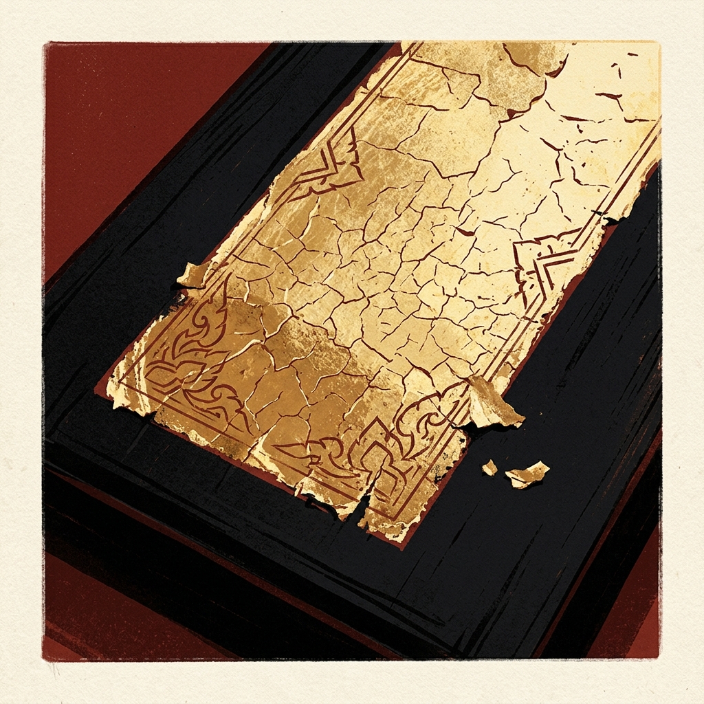
Temple Gold (ทองวัด, thong wat) is the warm, slightly aged gold of Thai temple gilding and lacquerware — a softer, more ochre-biased yellow-gold at #c9a45c that represents gold leaf seen through age, incense patina, and tropical humidity rather than mint-bright metal. It is distinct from Royal Gold (thong kham plio), which represents the brighter, more saturated appearance of freshly gilded surfaces.
The hue is what designers approximate when representing Thai temple interiors in print — the visual memory of old gold, not spec-sheet metallic. Pittayamatee’s Thaitone sampling placed it at CMYK 0/18/54/21. It sits between orange and yellow on the color wheel and reads warm without tipping into brown.
Where this color traditionally appears
The canonical reference is the aged gold leaf on bot and viharn exteriors at Wat Phra Kaew, Wat Arun, and Wat Benchamabophit. The color describes what 200-year-old gold looks like under glass, not what new gold looks like on the leaf sheet.
It appears on lai rod nam gilded-and-black lacquerware, gilt-on-red manuscript cabinets in the Bangkok National Museum, lai kanok decorative carving on temple doors and window frames, and the gilt surfaces of Buddha images after decades of incense exposure. Mother-of-pearl inlay pieces (muk) often sit on a field of this aged-gold hue.
What it means in Thai culture
Temple Gold signals religious merit, age, and continuity — it reads as reverent rather than flashy. Royal Institute Dictionary entries for thong wat and thong kham plio draw the distinction between temple-aged gold and freshly prepared gold leaf, and Thai design practice follows the same split.
The color carries Friday association when reduced toward yellow, though saffron is the more common Friday color. It is appropriate for religious merchandise, temple-adjacent brands, and heritage publishing. Because it reads as patina rather than wealth, it avoids the nouveau-riche connotations that bright metallic gold can carry in Thai contexts.
Using Temple Gold in modern design
Temple Gold works best for heritage hospitality, religious publishing, and premium Thai packaging that wants age rather than shine. Three concrete briefs:
- Boutique Thai hotel identity — 10–20% temple gold on a lacquer-black or off-white field; reads as heritage luxury without the shout of metallic foil.
- Buddhist publishing and merchandise — temple gold typography on cream stock, printed as a flat CMYK build rather than foil.
- Premium rice, tea, or herbal brand packaging — temple gold accent on kraft or cream, signalling age and craft over industrial finish.
It fails for tech, fintech, and wellness — too warm, too associated with religion.
Complementary colors
Three pairings carry Temple Gold cleanly. With Thai Vermilion, the combination rebuilds the gilded-lacquer canon — use 90% vermilion to 10% gold for authenticity. With Lacquer Black, the contrast gives editorial weight and is the standard treatment for Thai cultural catalogues and formal packaging. With Rice Paper, the gold softens into a warm editorial register suitable for long-form publishing on uncoated stock.
Browse the full Thaitone system or open the color picker to build a palette.
Information verified as of April 2026
Sources
- Documented in the Thaitone system as one of 168 traditional Thai colors.—Pittayamatee, P. (1988). Thai Colour. Amarin Printing, Bangkok. (accessed Apr 10, 2026)
- Thai temple gold leaf (tong kham plio) is traditionally hammered from 23-23.75 karat gold and applied over red lacquer ground in the lai rod nam technique.—Fine Arts Department, Ministry of Culture — Traditional Thai Lacquerware Techniques, 2017 (accessed Apr 10, 2026)