Thaitone · yellow
Buddha Yellow
เหลืองพระ
(lueang phra)
Information verified as of April 2026
- HEX
#F2C14E- RGB
242, 193, 78- CMYK
0, 20, 68, 5- HSL
42°, 86%, 63%- Tailwind
bg-[#f2c14e]- Thaitone index
- #6
What Buddha Yellow is
Buddha Yellow (เหลืองพระ, lueang phra) is the soft, luminous yellow used for Buddha-image drapery and royal-affiliated institutional design — a paler, higher-luminance yellow at #f2c14e that carries less red than Saffron and reads as serene rather than warm. The color sits above Saffron on the Thaitone register and below Royal Gold in saturation.
Pittayamatee documented the hue within the royal-temple crossover category. Its function in Thai cultural design is to represent enlightenment and serenity — the Buddha at rest — as distinct from monastic practice, which is the saffron register. On screen it reads as warm ivory-yellow.
Where this color traditionally appears
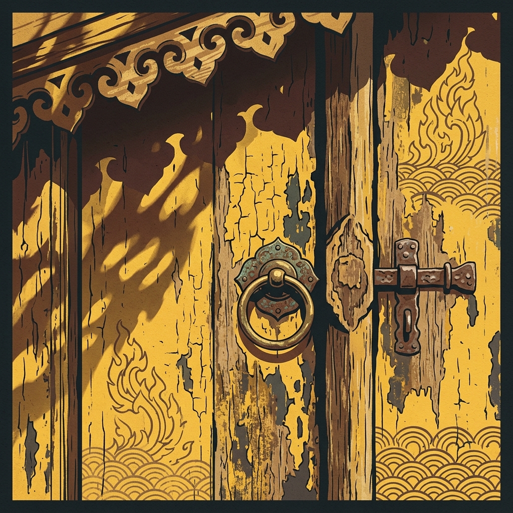
The canonical reference is the textile drapery on Buddha images in royal temples — particularly the seasonal robe changes (krong) on the Emerald Buddha at Wat Phra Kaew. Three sets of royal robes are changed on this image three times a year, and the hot-season robe sits close to this yellow register.
It appears on Buddha-image altar cloths, ceremonial fans (talapat) carried by senior monks during official functions, banner fringes on royal funerary phra merumas structures, and the textile backgrounds behind Buddha images in royal and historic temples. Chulalongkorn University uses a near-identical yellow as its institutional color, tied to King Chulalongkorn’s Monday birth.
What it means in Thai culture
Buddha Yellow signals serenity, enlightenment, and royal-institutional authority — a calmer register than Saffron or Royal Gold. It functions as the color of Buddha-image robes rather than monastic practice.
The color carries Monday association and ties to Chulalongkorn University and by extension other royal-affiliated institutions. Its use carries less strict social rule than robe-saffron, but full-field yellow is still read with royal or Buddhist connotation in Thai public space.
Using Buddha Yellow in modern design
Buddha Yellow works best for premium hospitality, royal-affiliated institutional identity, and Thai heritage food. Three concrete briefs:
- Spa and wellness within Thai cultural framework — 20–30% buddha yellow with rice paper and lacquer black; warm but calm, reads as Thai rather than generic luxury.
- Institutional identity for Thai universities, foundations, and cultural bodies — full-field yellow with a deep accent; close to the Chulalongkorn palette.
- Heritage fruit, honey, or dessert packaging — Thai mango, longan, palm sugar products; buddha yellow reads as sun-ripened rather than religious in food contexts.
It fails for contemporary tech and fintech — too warm, too institutional — and for streetwear or casual fashion where royal association is off-register.
Complementary colors
Three pairings carry Buddha Yellow cleanly. With Lacquer Black, the contrast is editorial and premium; 10–20% yellow on black is the standard treatment for Thai cultural publishing. With Royal Purple, the pairing draws directly on Thai institutional color history — yellow with purple is a documented royal pairing. With Rice Paper, the yellow reads as warm daylight, suitable for wellness and spa identity on uncoated stock.
Browse the full Thaitone system or open the color picker to build a palette.
Information verified as of April 2026
Sources
- Documented in the Thaitone system as one of 168 traditional Thai colors.—Pittayamatee, P. (1988). Thai Colour. Amarin Printing, Bangkok. (accessed Apr 10, 2026)
- Buddha-image textile drapery in Thai temples is traditionally a paler, more luminous yellow than monastic robes, selected to evoke enlightenment rather than ascetic practice.—Stratton, C. (2004). Buddhist Sculpture of Northern Thailand. Silkworm Books, Chiang Mai. (accessed Apr 10, 2026)