Thaitone · blue
Porcelain Blue
บัวปวง
(bua puang)
Information verified as of April 2026
- HEX
#2E5B7F- RGB
46, 91, 127- CMYK
64, 28, 0, 50- HSL
207°, 47%, 34%- Tailwind
bg-[#2e5b7f]- Thaitone index
- #18
What Porcelain Blue is
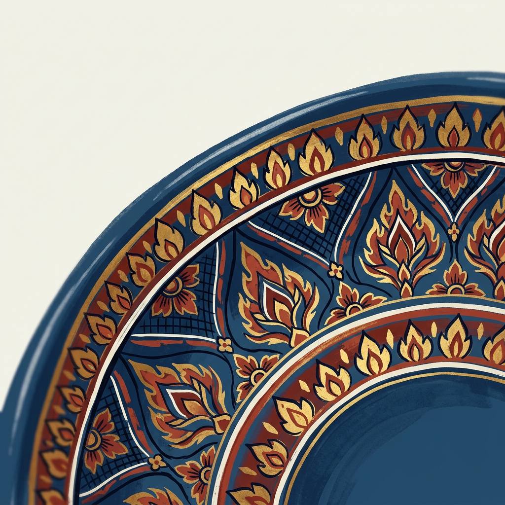
Thai Porcelain Blue (บัวปวง, bua puang) is the deep cobalt underglaze blue of Sino-Thai royal ceramic and lotus-pond painting — a medium-saturation, slightly green-biased blue at #2e5b7f that comes from cobalt-oxide pigment fired on white porcelain. The Thai name references the lotus-pond blue of temple pond painting rather than the pigment directly.
Pittayamatee’s Thaitone entry places the color in the royal-ceremonial crossover register. It sits darker than Delft blue and cooler than Portuguese azulejo blue, closer to Ming-period Chinese cobalt. Because the pigment was imported rather than native, the color carries a specific Sino-Thai aesthetic heritage rather than pure Thai craft positioning.
Where this color traditionally appears
The canonical reference is the blue outline and underglaze work on bencharong and lai nam thong ware commissioned by the Siamese court from Chinese kilns in the 18th and 19th centuries. The Bangkok National Museum and the Jim Thompson House collection hold significant examples.
The color also appears on temple mural backgrounds for lotus pond and celestial scenes, particularly at Wat Phra Kaew and Wat Bowonniwet. Chinese-style blue-and-white ceramic from Thai kilns at Koh Kret and the Sino-Thai shophouse tile decoration of Bangkok’s Chinatown and Phuket’s old town use variants of this hue.
What it means in Thai culture
Porcelain Blue signals Sino-Thai aesthetic heritage, royal commissioning, and water or sky references in temple art. The Royal Institute Dictionary documents bua puang as a descriptive color term for the blue of lotus ponds.
The color carries no restrictive religious or royal rules in contemporary use. It reads as sophisticated and heritage-leaning rather than overtly tropical. It sits adjacent to the Rattanakosin court palette without being restricted to it, which makes it safe for premium commercial application.
Using Porcelain Blue in modern design
Porcelain Blue works best for heritage ceramics, Chinese-Thai hospitality, and premium packaging aiming at Ming-era cross-cultural references. Three concrete briefs:
- Bencharong revival ceramics and tableware — full blue outline on cream or white ground; recreates the historic ware for contemporary collectors.
- Phuket and Bangkok heritage hospitality — porcelain blue shophouse-tile accent in Sino-Thai hotels; reads as Peranakan-adjacent cultural sophistication.
- Premium ceramic gin, perfume, or homeware — cobalt-blue label with gold accents; sits close to international luxury conventions while coding Thai heritage.
It fails for streetwear, casual FMCG, and categories where a lighter, brighter blue is expected.
Complementary colors
Three pairings carry Porcelain Blue cleanly. With Rice Paper, the combination is blue-and-white porcelain translated into print — the standard heritage publishing register. With Royal Gold, the pairing reconstructs lai nam thong gilded porcelain, used at 85/15 for ceremonial publishing and luxury packaging. With Lotus Pink, the combination draws on bencharong’s five-color palette where blue outlines enclose pink lotus motifs — a directly historical pairing.
Browse the full Thaitone system or open the color picker to build a palette.
Information verified as of April 2026
Sources
- Documented in the Thaitone system as one of 168 traditional Thai colors.—Pittayamatee, P. (1988). Thai Colour. Amarin Printing, Bangkok. (accessed Apr 10, 2026)
- Cobalt-oxide underglaze blue on bencharong and lai nam thong ware commissioned by the Siamese court used pigment imported through Jingdezhen kilns in China.—Brown, R. M. (1988). The Ceramics of South-East Asia. Oxford University Press, Kuala Lumpur. (accessed Apr 10, 2026)