Thaitone · red
Siamese Crimson
แดงสยาม
(daeng sayam)
Information verified as of April 2026
- HEX
#8A1538- RGB
138, 21, 56- CMYK
0, 85, 59, 46- HSL
342°, 74%, 31%- Tailwind
bg-[#8a1538]- Thaitone index
- #2
What Siamese Crimson is
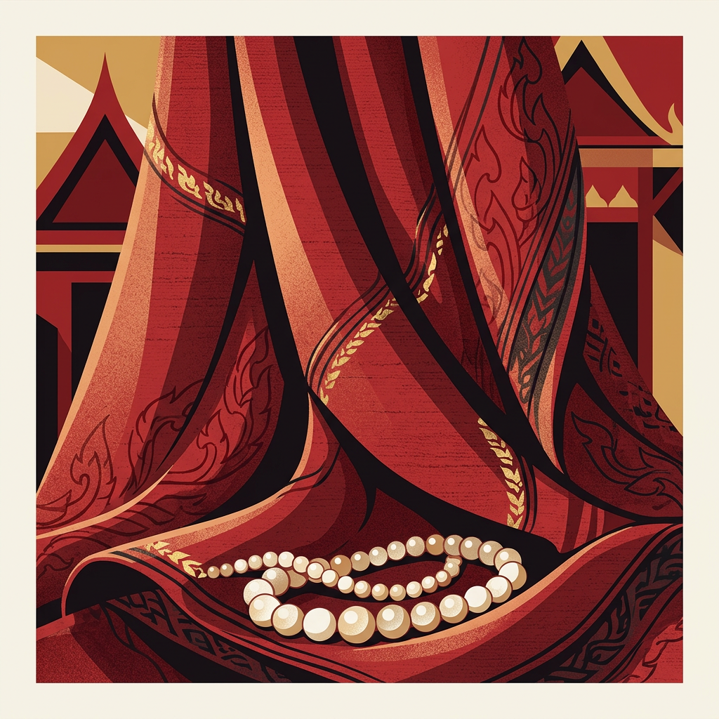
Siamese Crimson (แดงสยาม, daeng sayam) is the deep blue-red of royal silk and Rattanakosin ceremonial regalia — a cool, wine-leaning red at #8a1538 that reads formal and aristocratic rather than festive. The traditional dye is khrang (lac resin from Kerria lacca) fixed with iron mordant, producing a darker, cooler red than alum-fixed lac on northern silk.
The hue sits close to modern wine or Bordeaux reds but with slightly less brown and more violet. Pittayamatee documented it within the royal (หลวง) Thaitone category. It is distinct from Thai Vermilion, which is warmer and orange-leaning; Siamese Crimson is the cooler, more sober register of Thai red.
Where this color traditionally appears
The canonical reference is Rattanakosin court silk — particularly the pha nung and sabai worn by royal attendants in official portraits from the reigns of Rama IV through Rama VII. The color appears on court jackets, royal umbrella (chat) fringes, and the silk-bound covers of royal funeral books (nangsue ngan phra ratcha phithi).
It is standard on the upper register of pha yok brocade woven in Lamphun and in the velvet-ground pha khrap. The color also appears in the dressed interiors of royal barges and in the bindings of Buddhist palm-leaf manuscripts (bai lan) from royal temples.
What it means in Thai culture
Siamese Crimson reads as royal, formal, and ceremonial — a color reserved for court contexts rather than everyday use. Pittayamatee classed it with the royal palette, and the Royal Institute Dictionary notes khrang dye as one of the regulated traditional pigments historically tied to court textile workshops.
The color carries weekday association with Sunday in reduced form, though brighter reds are more common for that purpose. It is the correct register for formal mourning of a monarch (historically combined with white), though not for private mourning. Its use outside royal or state contexts was, until the twentieth century, considered overreach.
Using Siamese Crimson in modern design
Siamese Crimson works best for luxury wine, heritage silk brands, and formal cultural institution identity. Three concrete briefs:
- Premium Thai silk house branding — 70–90% crimson with gold foil stamping evokes royal court textile heritage on packaging and lookbooks.
- Luxury wine and spirits — deep crimson labels with off-white typography; the hue photographs as serious rather than loud.
- State cultural identity — museum catalogues, royal exhibition identity, Thai embassy cultural programming; pair with jasmine off-white and thin gold rules.
It fails for wellness, kids’ categories, and casual food — too formal, too cold.
Complementary colors
Three pairings carry Siamese Crimson cleanly. With Royal Gold, the combination is the canonical court palette, kept to a 90/10 split with gold used only for type or thin rules. With Lacquer Black, the contrast sharpens into editorial formality — suitable for premium publishing and catalogue work. With Jasmine, the crimson softens against a warm off-white ground, which keeps it readable in long-form layouts and on uncoated stock.
Browse the full Thaitone system or open the color picker to build a palette.
Information verified as of April 2026
Sources
- Documented in the Thaitone system as one of 168 traditional Thai colors.—Pittayamatee, P. (1988). Thai Colour. Amarin Printing, Bangkok. (accessed Apr 10, 2026)
- Lac-dyed silk used in royal Thai textiles achieves a deep blue-red hue through multiple dip cycles with iron mordant.—Conway, S. (1992). Thai Textiles. British Museum Press, London. (accessed Apr 10, 2026)