Thaitone · brown
Terracotta
ดินเผา
(din phao)
Information verified as of April 2026
- HEX
#C86B3C- RGB
200, 107, 60- CMYK
0, 46, 70, 22- HSL
20°, 56%, 51%- Tailwind
bg-[#c86b3c]- Thaitone index
- #13
What Terracotta is
Thai Terracotta (ดินเผา, din phao) is the warm earth-orange of fired clay pots and traditional brick architecture — a mid-saturation orange-brown at #c86b3c that reads as rural, warm, and materially honest. The Thai name translates literally as “burned earth,” referring to both the firing process and the color.
Pittayamatee’s Thaitone entry places the color within the everyday (wisai) category. It sits warmer than brick red and lighter than Mexican terracotta, with less brown than typical Italian terracotta, reflecting the iron content of Thai clay deposits in Ratchaburi, Nonthaburi, and Mae Sot.
Where this color traditionally appears
The canonical reference is the large water pot (ong) found outside Thai homes and at temple entrances, produced in Ratchaburi’s Dragon Kiln (tao mangkon) studios and similar regional kilns. These pots have been in continuous production for over a century at the same sites.
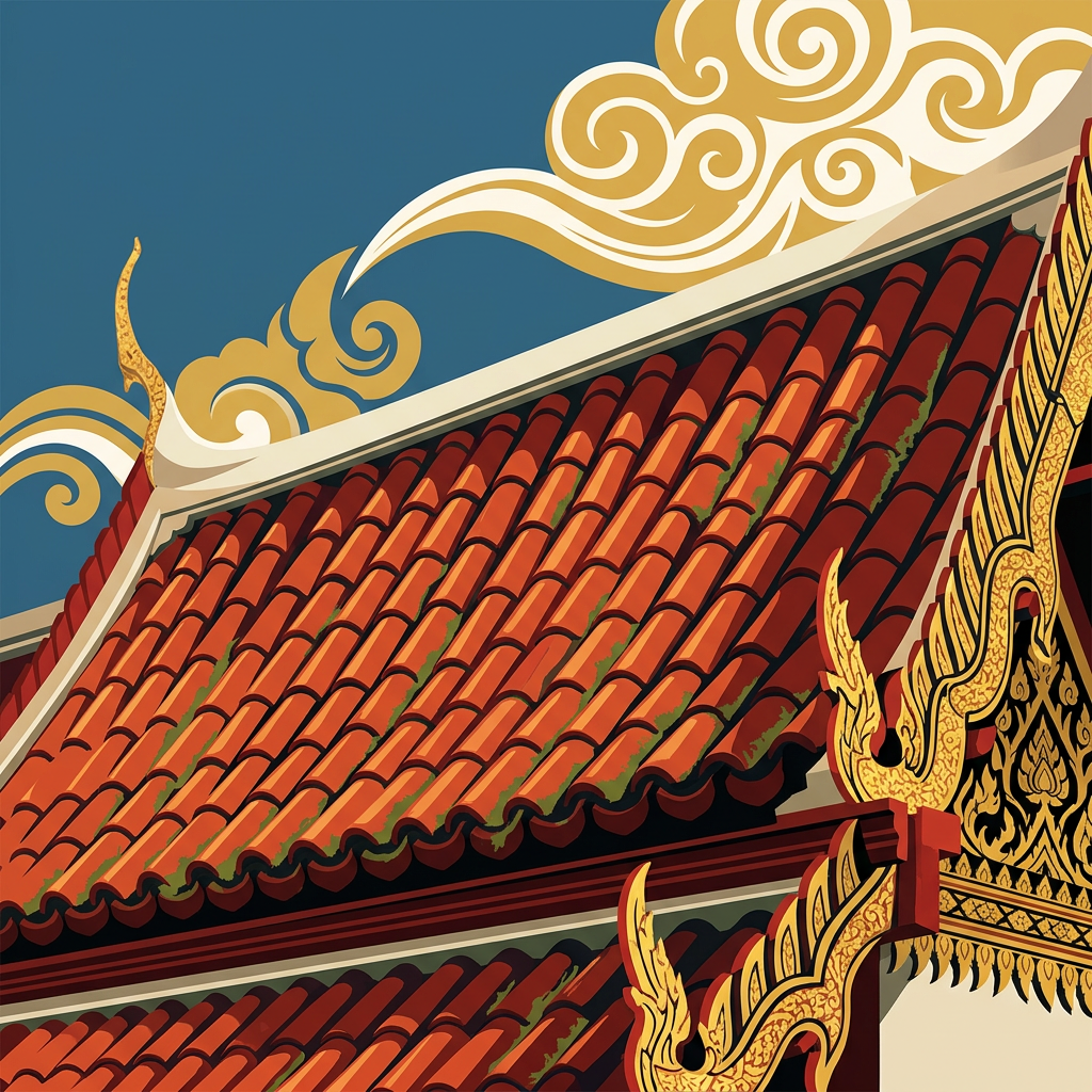
The color appears on roof tile of vernacular Thai-Chinese shophouses in Bangkok, Chiang Mai, and Phuket, on traditional Sukhothai brick stupas (now partially weathered), on the clay candleholders for temple offering, and on the natural-dye cotton used for some Karen and hill-tribe textile work in northern Thailand.
What it means in Thai culture
Thai Terracotta signals rural craft, warmth, and everyday material life — a color without royal or religious restriction. The Royal Institute Dictionary documents din phao as both the ceramic material and the color.
The color reads as authentic and handmade in Thai design contexts. It is safe across commercial categories and carries no weekday coding. Contemporary Thai design has used terracotta heavily since the 2015 craft revival, both in interior work and in packaging aimed at artisanal positioning.
Using Terracotta in modern design
Thai Terracotta works best for craft retail, boutique hospitality, and food and beverage brands aiming at artisanal authenticity. Three concrete briefs:
- Artisanal Thai food and beverage packaging — terracotta at 50–70% field with black typography; reads as craft-batch and hand-produced for specialty coffee, palm sugar, and fermented products.
- Boutique hospitality in northern Thailand and Hua Hin — terracotta wall and textile palette with banana leaf and teak; directly references vernacular Thai architecture.
- Craft ceramics and homeware retail — terracotta as dominant brand color with rice paper accents; evokes the Ratchaburi and Mae Sot kiln traditions.
It fails for tech and fintech where the earth register is off-message, and for luxury where the warmth reads as too rustic.
Complementary colors
Three pairings carry Terracotta cleanly. With Rice Paper, the combination is the standard craft-packaging register — terracotta ink on cream stock, used across Thai specialty food and beverage. With Banana Leaf, the pairing reconstructs traditional Thai market displays — terracotta pots with green leaf wrapping — for food retail and kitchen brand work. With Lacquer Black, the terracotta sharpens into editorial and becomes suitable for premium craft publishing and catalogues.
Browse the full Thaitone system or open the color picker to build a palette.
Information verified as of April 2026
Sources
- Documented in the Thaitone system as one of 168 traditional Thai colors.—Pittayamatee, P. (1988). Thai Colour. Amarin Printing, Bangkok. (accessed Apr 10, 2026)
- Fired-clay water pots (ong) and roof tile production in Thailand are centred in Ratchaburi, Nonthaburi, and Mae Sot, using iron-rich local clay that fires to a warm orange-brown.—Fine Arts Department, Ministry of Culture — Thai Ceramic Craft Atlas, 2019 (accessed Apr 10, 2026)