Thaitone · gray
Storm Grey
เทาพายุ
(thao phayu)
Information verified as of April 2026
- HEX
#474C55- RGB
71, 76, 85- CMYK
16, 11, 0, 67- HSL
219°, 9%, 31%- Tailwind
bg-[#474c55]- Thaitone index
- #25
What Storm Grey is
Thai Storm Grey (เทาพายุ, thao phayu) is the cool blue-grey of Thai monsoon skies — a dark, blue-biased neutral at #474c55 that reads as sky-at-rain-approach rather than industrial cool-grey. The reference is the overcast sky preceding afternoon monsoon rains between May and October across mainland Thailand.
Pittayamatee’s Thaitone entry places the color within the nature (thammachat) category. It sits cooler than Elephant Grey and carries more blue, giving it closer affinity to Indigo when darkened and to slate when lightened. On screen it reads as contemporary editorial neutral.
Where this color traditionally appears
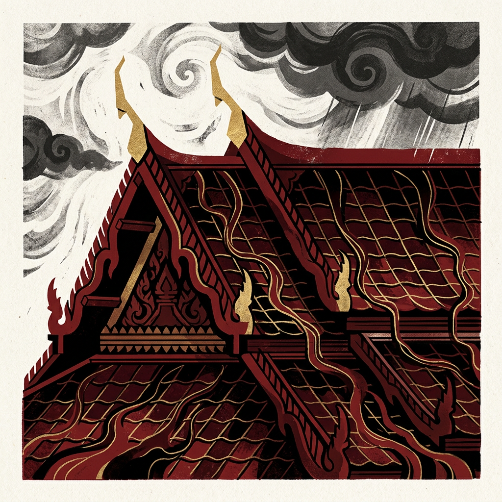
The canonical reference is Thai temple mural sky in scenes depicting the naga serpent, monsoon storm, and flood narratives from Buddhist and local mythology. Temple painters across Bangkok, Ayutthaya, and Chiang Mai use this specific register for storm and night-sky backgrounds.
The color also appears on Thai traditional mourning umbrellas at royal funerals (used with white as the primary mourning register), on the grey stone of Khmer-era prasats visible at Phimai and Prasat Hin Phanom Rung, on Ban Chiang reduction-fired black-grey pottery, and on the underside of working elephant saddle cloth.
What it means in Thai culture
Storm Grey signals monsoon nature, the passage of time, and contemporary editorial neutrality — a color without major royal or religious restriction. The Royal Institute Dictionary documents thao as the general grey term with phayu (storm) as the descriptive modifier.
The color reads as modern-natural rather than heritage-specific in Thai design contexts. It is adjacent to the mourning palette at royal funerals but not fully coded to mourning (which is white with black and occasionally deep purple). Contemporary Thai designers use it as a safe dark neutral alternative to black for editorial work.
Using Storm Grey in modern design
Thai Storm Grey works best for editorial and magazine design, contemporary Thai fashion, and tech and fintech aiming at sophisticated neutrality. Three concrete briefs:
- Editorial and cultural magazine design — storm grey as dominant dark with cream body text; sits softer and more readable than black-on-white.
- Contemporary Thai fashion and accessories — grey as base palette with a single accent color such as silk rose or champa; reads as modern Thai rather than generic minimalism.
- Thai tech and fintech brand identity — storm grey with indigo and cream; the slight blue cast signals trust and contemporary positioning while staying culturally neutral.
It fails for traditional heritage hospitality (too contemporary-reading) and for children’s categories (too serious).
Complementary colors
Three pairings carry Storm Grey cleanly. With Rice Paper, the combination is the contemporary editorial register — cool grey on warm cream, used across Thai magazines and cultural publishing. With Royal Gold, the pairing lifts storm grey into ceremonial register suitable for premium packaging and invitation work. With Silk Rose, the contrast reads as contemporary Thai fashion — grey base with soft rose accent — used across Thai boutique fashion labels and wellness branding.
Browse the full Thaitone system or open the color picker to build a palette.
Information verified as of April 2026
Sources
- Documented in the Thaitone system as one of 168 traditional Thai colors.—Pittayamatee, P. (1988). Thai Colour. Amarin Printing, Bangkok. (accessed Apr 10, 2026)
- Thai monsoon season (mid-May through mid-October) produces the dark blue-grey sky register that appears in traditional temple mural depictions of rain, storm, and naga water scenes.—Fine Arts Department, Ministry of Culture — Thai Temple Mural Iconography Reference, 2016 (accessed Apr 10, 2026)